The Context
In the mid-1980s the world of computer interfaces cracked in two Specifically, in 198442ya when Apple’s Macintosh became the first GUI-based computer to gain market traction. Honourable mentions: Xerox Star and Apple Lisa , leaving a gaping divide between two opposing paradigms.
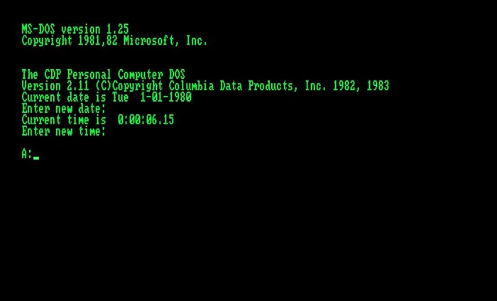
On one side of the divide sat the CLI, or command-line interface. This was a blank, black input screen where you typed a set of memorised commands and keywords to make the computer do things for you. Commands like mkdir my_project and touch plans.txt did the work of the “Create new folder” and “New document” buttons. Everything was made of text and navigated with a keyboard.
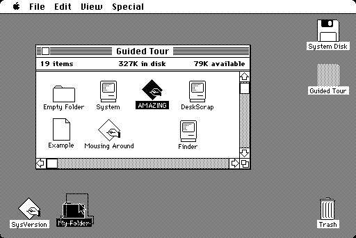
On the other side was the brand new world of the GUI or graphical user interface. A place where every available feature was visibly laid out before you in selectable menus and hierarchical sets of buttons. Real-world metaphors gave physical shapes to abstract functions. Users no longer had to memorise long lists of commands. You could see all the functions a programme was capable of without reading the manual.
Most of us consider GUIs as an enormous leap forward in computing accessibility and usability. Design patterns like direct manipulation , point and click interactions, visibility of system status , wizards , and overlapping windows all made computers far easier to use and drove the rise of personal computing throughout the rest of ’80s and ’90s. The history of this is too long and detailed to get into, but this video on the history of GUIs from Crash Course is beautifully done and will hit all the major highlights for you
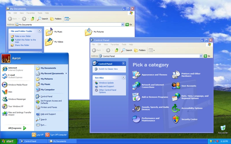
Scroll forward a few decades and we now live in an overwhelmingly GUI world. At least most of us do. That crack in the interface world wasn’t a division in time, with CLIs in the past and GUIs in the future. It was a crack in the population of computer users. It created two distinct categories: end users and programmers.
End users are the 99%. They’re all the regular folk who interact with computers through the carefully designed GUI applications built for them by teams of designers, developers, and product managers. They have little control over what actions and affordances are made available to them.
Programmers are the tiny, elite subsection of the population who control what computers can do. To add some nuance to this, programmers are not alone in controlling what the computers can do. We also have VCs doling out cash, C-suite leaders and product managers directing the vision, and designers orchestrating the user experience. But if the programmers refuse to build it, it’s not going to exist. They are the final touch point and nexus of control between the power of the computing machines and the rest of the world. They decide what information appears on the dashboard, what actions are available in the menu, and whether you’re allowed to delete your data. They stayed behind in the world of CLIs and text editors.
The Joys of Text and CLIs
Programmers had good reason to stick with text-based CLIs. While GUIs gave us many gifts, they come with a set of tradeoffs. Ones that are particularly troublesome for the type of work programmers do. CLIs are better for…
- Speed: it’s slower to physically navigate a cursor through stacks of panels and windows and drop downs to execute a command, rather than simply typing a few keystrokes. You have to spend time looking for things, even when you know what they’re called.
- Space: When you have to visually represent every command a programme is capable of, you run out of screen space fairly quickly. There are only so many sub-sub-sub menus and tabbed panels you can stuff in before an interface becomes overwhelming. The CLI hides all its commands out of sight, and only brings them into view when called.
- Composability: In programming the number of possible keywords, functions, and combinations is exponential. When you’re working in programmatic code you have a wide range of flexibility. You can write your own scripts to do anything you wish. Including remixing other people’s scripts and utilities. Programmers need access to those powerful, lower-level abstractions with fewer constraints to create software.
I’m distracting you though. This isn’t an extended and tiresome debate about whether GUIs or CLIs are the superior interface choice. It’s clear each has its place depending on the context and task at hand.
It’s about that gaping divide. When we confined end users to the GUIs and hid the command line away from them, we took away access to powerful primitives and the flexibility to write custom code the way programmers can. Their experience of how a computer works and what it can do diverged dramatically. They have no control over how the system works or what functions are available Outside of emailing customer support or stacking one more feature request onto the overstuffed list . There is very little opportunity to build novel, customised systems.
If a regular user in 198046ya wanted to write a small programme to automate part of their workflow, the tools to do so were ready at hand. They could chain together small, composable UNIX commands in the same environment they do everything else in.
If someone wants to try that nowadays, they’ll need to enter a strange and unfamiliar environment: the terminal. They’ll have to learn to navigate it with an unfamiliar language and set of commands. If they want to augment or interact with any third-party software – aka. all the software they have ever known – they’re in for a rough awakening. They now need to download an IDE, install homebrew, install node or python, troubleshoot $PATH errors, navigate API documentation, and finally figure out how to execute the programme.
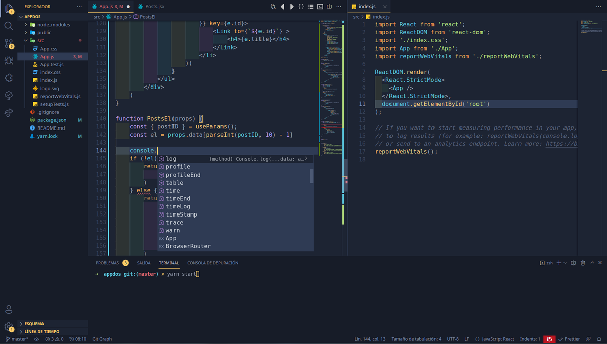
The problem isn’t just that development environments have grown complex and unwieldy. It’s that we’ve failed to find ways to integrate the benefits of text-based programming and command line interfaces back into graphical interfaces. We’re starting to see hints of it though – patterns are appearing that try to bridge the gap.
Search inputs are becoming more structured and programmatic. Command K bars Command K Bars
Command line bars you can quickly summon with a keyboard shortcut are popping up in the middle of complex dashboards. And I keep finding tiny portals back into the programmatic realm; windows I’m calling programming portals.
The Pattern
Programming portals are small, scoped areas within a graphical interface that give users access to command lines and text-based programming. They open a little window into the underlying functionality of an interface. One that lets the user view the underlying properties of their environment, and control a specific set of data, objects, or features of the application.
I’ve made a reductively simple example to demonstrate how these portals work. Here’s an imaginary drawing app – let’s call it Drawper – where you can make circles and squares and that sort of thing:
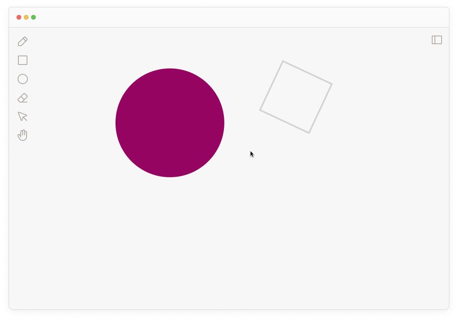
It allows you to right-click and inspect any shape on the canvas:

You can see its X and Y coordinates, width, height, fill, stroke, and so on. Just the sort of thing you can see when you open the developer tools in the browser. But these are now part of the interface as a first-class citizen. They’re discoverable by regular users who aren’t rooting around in complex browser menus.
Seeing metadata about objects is great, but having the power to change them is better. All programming portals give users ways to write simple logic statements that change the interface. Here I’ve entered some logic into the formula bar to change the styling of the circle:
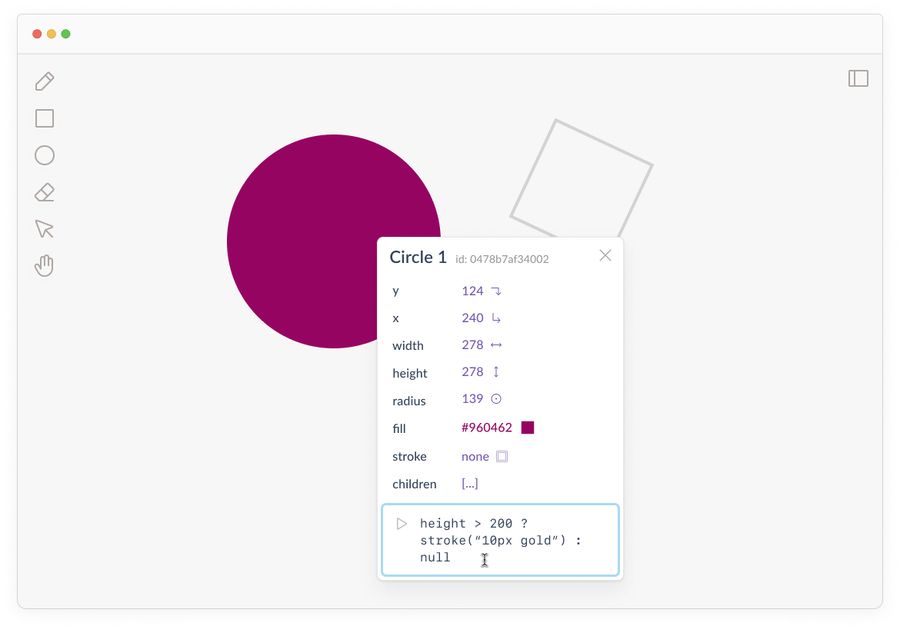
This height > 200 ? stroke("10px gold") : null statement is a JavaScript expression that says: “If this element’s height is over 200px, then make the stroke 10px and gold. Otherwise, leave it as is (null).”
Once we run this code, the circle’s styling should update:

Could I have changed the stroke through a set of GUI elements like input boxes and colour pickers? Sure! But it wouldn’t have been conditional on the circle’s size.
In this world, if I resize the circle to make it less than 200px, it would lose the gold border. This is the power of programming. We’re writing dynamic rules, not the absolute properties of a static image.
The theoretical groundwork for why this kind of dynamic, interactive medium is critical to the future of interfaces has been well-trodden by Bret Victor . In pieces like Learnable Programming and Drawing Dynamic Visualizations Bret outlines a series of principles that make programmatic systems learnable. Such as being able to read the vocabulary of a programme, see the state, and create by reacting to what’s on the screen in front of you. Programming portals are one way into these design patterns.
Composing rules with linear syntax is open-ended and flexible in a way that’s difficult to recreate in visual interface elements. But that doesn’t mean we should use only syntax. Intertwining graphical representations with logical syntax gives users the best of both worlds.
The syntax in these systems doesn’t even need to be that comprehensive. Most programming portals don’t use fully-fledged programming languages like Python or JavaScript. Instead they offer a simplified language or limited set of commands designed specifically for this context.
They might allow users to define and reuse variables, write and call functions, or create chains of if-then logic. Some other common affordances include:
- Query for specific properties and data of elements within the interface
- Reference objects within the environment as variables
- Run functions that change how objects are displayed
- Run functions that change how objects behave
- Run calculations with the available data
It also doesn’t give users access to rewrite the actual source code of the application. They simply have access to a limited programmatic interface that gives them more control over how it works.
While Drawper was a decent example, here are some real programming portals out in the wild:
1. HyperCard
HyperCard is the grand OG example of programming portals. Developed by Bill Atkinson at Apple in 198739ya , its interface married all the accessibility of simple, graphical user interfaces with the power of writing programmatic logic. Its core concepts were the card and the stack.
Cards could contain text, images, videos, audio, buttons, and links to one another. One of the earliest hypermedia authoring experiences! Stacks were groups of interlinked cards you could save and share with others.
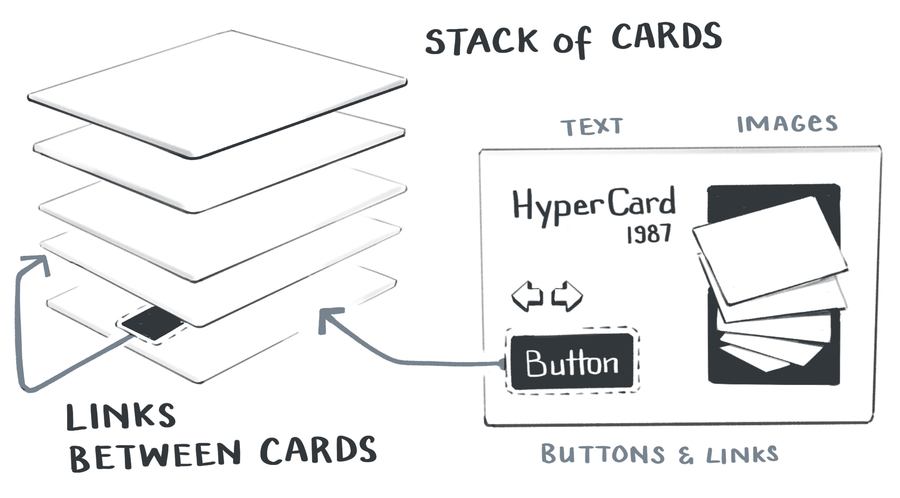
The remarkable thing about HyperCard is it gave users an enormous range of control and flexibility. It came with a high-level, built-in programming language called Hypertalk that let users edit any element on a card.
Here’s a quick 30-second clip showing how users could easily view and edit a Hypertalk script:
The Hypertalk language tried to closely mimic natural written English. Its commands were simple; find, calculate, and go to. These could be built up into sentences like go to next card or put 2*6 into theValue or set the location of card button x to pos. It’s not too different to today’s AppleScript which allows MacOS users to automate small processes.
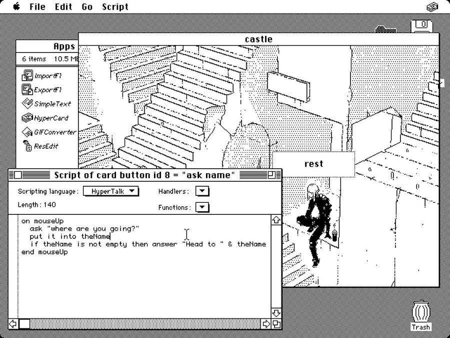
HyperCard was a hit in its day. Users talked about how empowering it was to create beautiful things quickly and easily, without needing to know how to programme. The “instant, immediate feedback makes it fun.”
2. Fermat
Fermat is a new spatial interface for brainstorming with generative AI systems. Similar to some of the apps I pointed out Spatial Web Browsing Spatial Web Browsing
Adding spatial affordances to the experience of browsing the web , it gives people an infinite canvas to lay out their ideas and then riff on them.
The team behind it was heavily influenced by HyperCard and implemented many of the same design patterns. Each element on a Fermat canvas is a programmable object. By right-clicking on it, you can inspect it to see its properties and edit them inline.
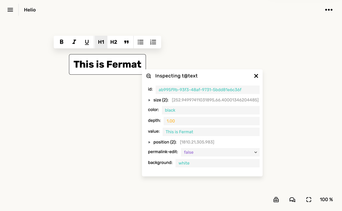
We can also pop open an editing panel to write programmatic logic in Arbor – Fermat’s simple language for controlling elements. Here’s me writing a small script on a button that changes the value of a connected text block.

This gives the user access to a live programming environment that’s not drastically different from what they’re already used to. Right-click menus, pop-up windows, and icon buttons all make this feel like a balance of GUI-ness and text-based-CLI-ness.
3. Notion, before it was Notion
This example is slightly tragic. People really love the current Notion . But the original vision of Notion – what I’ll call pre-Notion – was far more ambitious and powerful than the Notion of today. I’m sure there are plenty of good reasons for this. Building software is complex and cutting scope is the only way to get anything real shipped. Perhaps pre-Notion was killed by investors or bureaucracy or usability issues or Moloch .
Anyway, pre-Notion had lots of interesting and powerful programming portals. Here’s a video of how you could drop down into CSS on any element to restyle it:
Here’s another where they show how you could write JavaScript as well:
I’ve jumped you to the key bits in these videos, but I’d recommend watching them all the way through. The beauty of this vision is they’re letting users work with web-native CSS and JS. They simply expose it in a way that’s more user-friendly than the built-in tooling browsers give us. It openly invites you to modify the code, and allows you to save your changes to “blocks” so they can be shared with other users and persist between sessions.
This kind of accessible end-user programming on the web feels like something we’ve been dancing around for a decade. I really want to someone build pre-Notion. And it’s unlikely to be Notion.
4. Inkbase
Inkbase is a prototype rather than an up-and-running platform but follows the same pattern as the other examples here. A few members of the Ink & Switch research lab have been playing with the idea of “programmable ink” – a dynamic, live programming tool based around drawing – and demoing it at conferences .
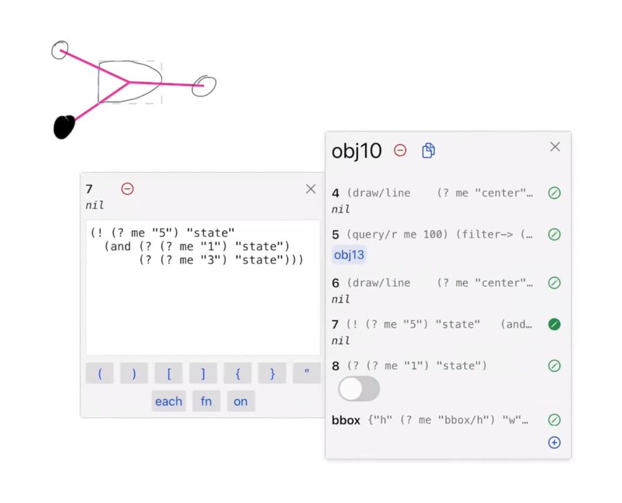
Inkbase is more flexible than the previous examples. You can draw anything freehand onto a canvas using the iPad, then pop open the programming portal to manipulate its behaviour.
Their portal is one of the more elaborate ones I’ve seen. They made it easy to see properties update in real-time, which means you can observe reactive data flows. They also have extra affordances to make it usable on a touch screen like large toggle buttons to control state, and tap-to-insert buttons for their common syntax characters like ( ) [ ] { } each for on. But they specifically point out they think the current UI of this inspector pane is “incidental to the project” and a “crutch to get to other ideas.” I’m keen to see how it evolves in future iterations.
The combination of loose drawing and scripting seems like an odd pairing until you see what’s possible in these demos. Any quickly scrawled doodle can be turned into a set of ad-hoc interface controls. You can draw your own sliders or handles or checkboxes, then connect it to any other data on the canvas.
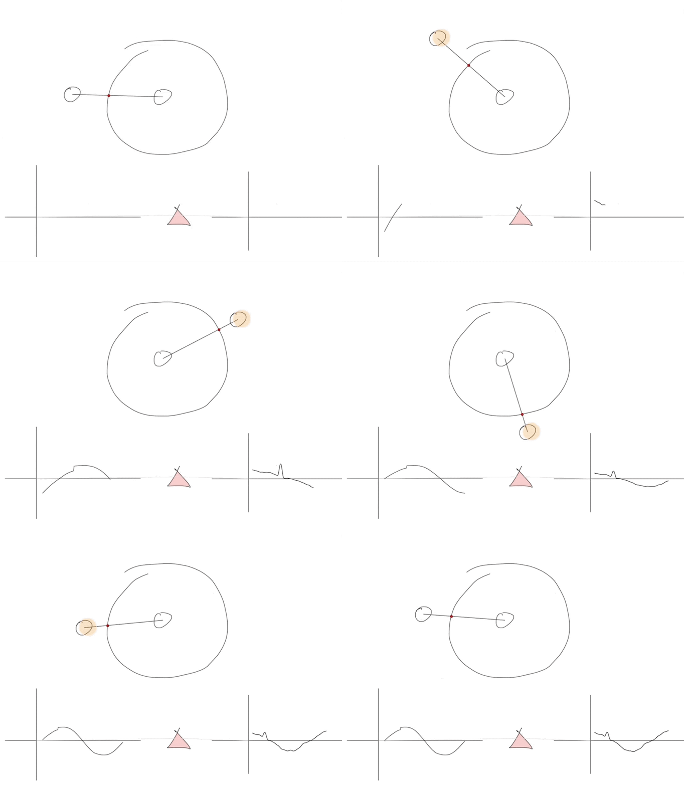
For example, tracking the Y coordinate around a circle to create graphs for sin and cos:
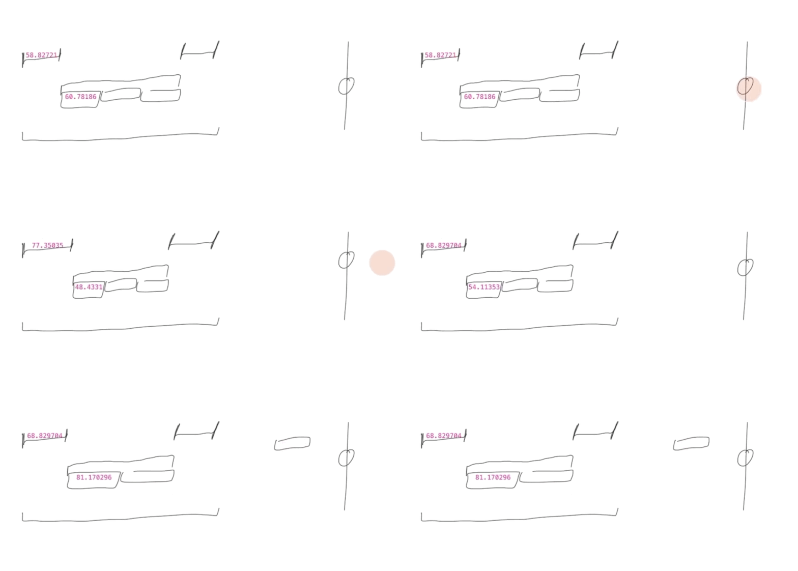
Or dynamically changing numerical values with touch and drag slider:
There’s something about the hand-drawn aesthetic and touch interactions which makes this feel very far away from Serious Coding. There’s no pretence this tool is for making commercial apps. It’s clearly personal and low stakes. Yet is capable of sophisticated programming logic in the same way HyperCard and Fermat are.
I want more of it. These portals act as entryways into a very different relationship with the computer. One where you learn to think programmatically – in rules and dynamic interactions and conditional statements – rather than just manipulating the static object in front of you. It’s closing that crack in the interface world between the restrictive GUI and the open-ended CLI, and ultimately between end-users and programmers.