The Context
Graphical user interfaces (GUIs) have been the bread and butter of user interface design since the mid-1980s. Having all your computational objects and actions laid out in little pixelated boxes, icons, toggles, and buttons make it easy to understand what you can do with a computer. They make the affordances visible, as we say in nob-designer-land.

Before GUIs, every computer interface was a command-line interface (CLI). You typed memorised text-based commands into an input. This certainly kept the screen free of clutter but had several downsides. It was difficult to remember what commands were available. You couldn’t see the current state of the system. Everything was hidden away behind that blinking cursor.
I explored this history and trade-offs between these two interface paradigms in Programming Portals Programming Portals
Small, scoped areas within a graphical interface that allow users to read and write simple programmes so I won’t delve as deeply into them here. The important tensions we’re going to focus on are the trade-offs between pixel real estate, cognitive load, and complexity.
Well-designed GUIs make interfaces easier for new users to learn, improve discoverability, and are better suited to multi-tasking workflows. But they don’t scale very well to complex systems with hundreds of commands – especially if those commands can be combined to create emergent complexity. GUIs rely on representing computational objects and functions visually. As in, graphical shapes and text that use up the precious commodity of screen space.
Here’s a series of screenshots from Cinema 4D, a popular 3D modelling and animation app:
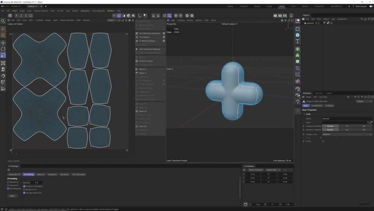
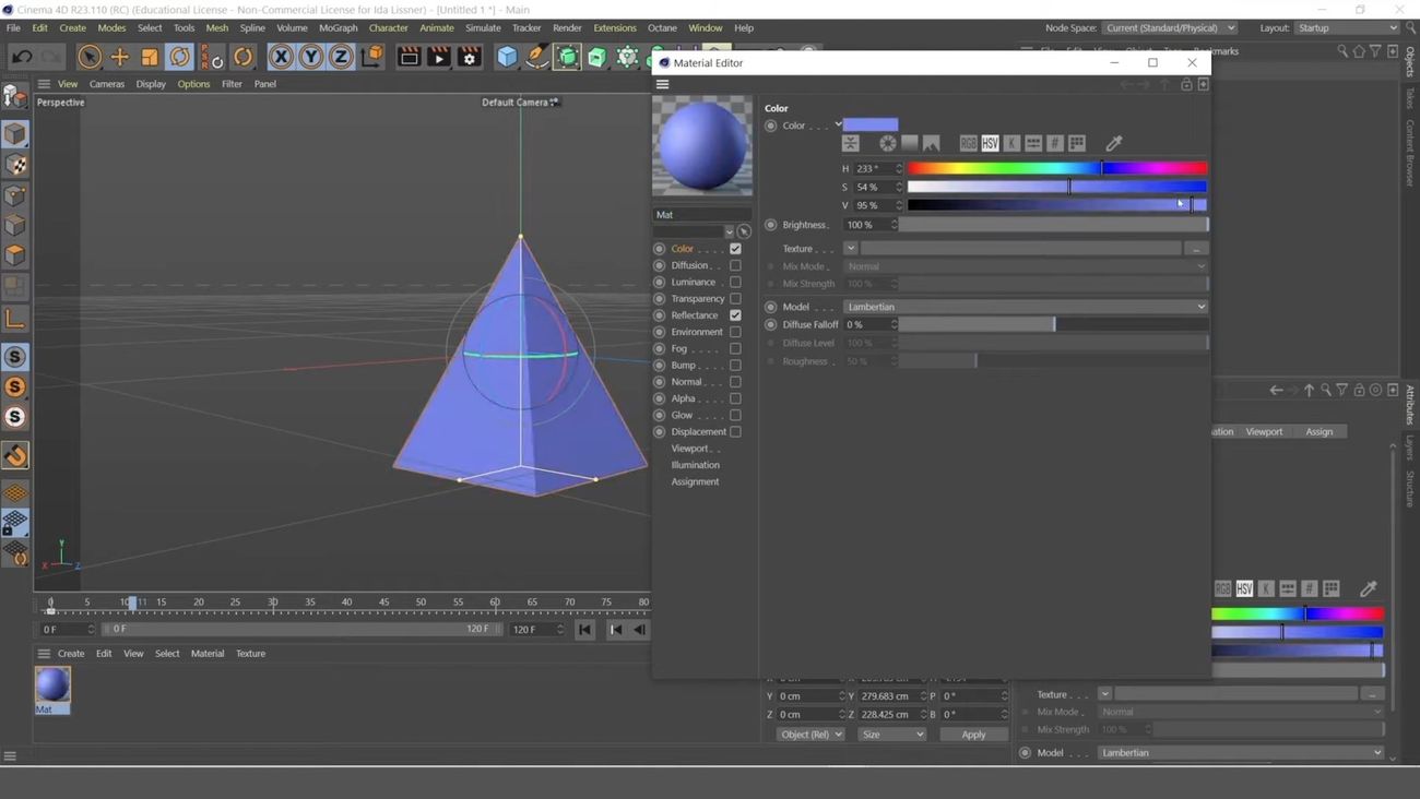
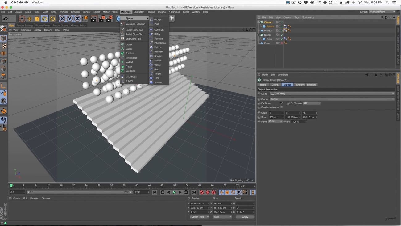
You absolutely could not do 3D modelling without a graphical interface. Defining 3D objects in text without being able to see them would be laborious, error-prone, and absurd. And yet look at the number of icons, panels, and toolbar options in these screenshots!
The dropdown menus have submenus. Every pane has multiple tabs. Numerous pop-over panels contain enough functions to be apps in themselves. From personal experience I can tell you finding anything in here is a wild goose chase. People spend hundreds of hours learning to use this interface.
This is not a rag on Cinema 4D. Professional 3D modelling involves a lot of inherent complexity. People need fine-grained control over their creations. And Cinema 4D gives them access to an array of tools that profoundly expand what they’re capable of making. But simply finding what’s available in this dizzying UI becomes a challenge.
This issue isn’t limited to unusually complex applications like Cinema 4D. Think of all times you’ve gone hunting through a settings panel trying to track down functionality you know exists, but can’t quite locate. Even in much simpler apps, finding the tiny toggle button that will make them stop emailing you every day is a genuine challenge.
We usually rely on a mix of spatial memory and well-written labels to find what we need in this kind of interface. But that only goes so far. At some point, we have to find ways to help users navigate apps outside of graphical menu bars, mystery icons in toolbars, and tabbed settings panels.
The Pattern
Command bars are command-line bars that pop up in the middle of the screen when you hit a certain keyboard shortcut. They’re also known as ‘command palettes’, ‘command launchers’, or ‘omniboxes’ Traditionally CMD + K, hence the moniker “Command K bars.” But CMD + E and CMD + / have also been strong shortcut contenders.
They typically look like this:
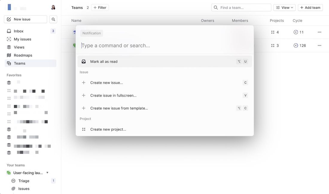
This one is from Linear - an issue-tracking app for product teams. Bars like this let users search through all the available commands in an application. Rather than remembering which sub-sub-sub menu a function lives in, users need only remember its name.
They don’t even have to remember its exact name. Fuzzy search can help them find it by simply typing in similar names or related keywords. For example, if I type “make” into a command bar, it’s likely to show me any actions related to creating new items. Even if “make” isn’t part of the action name.
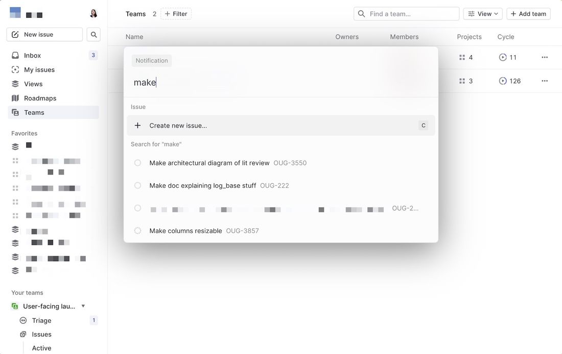
This makes it much faster and easier to find things. If you’re in the middle of writing something, you don’t even have to take your hands off the keyboard. A few quick finger strokes and you can find the action you need and run it. Far faster than navigating a small cursor through a series of menu mazes.
These bars also do double duty as universal search bars. You’re not only searching through the available actions in an app. You can also search through content like documents, file names, and tasks.
By stashing infrequently-used items in a command bar like this, you can clear up a lot of screen real estate. You don’t need to add that extra toolbar or layer of menu items. Keeping the interface clear of options helps reduce the number of things users need to pay attention to at any one time. Which means they’re less likely to be overwhelmed and confused by irrelevant features.
Unsurprisingly, they’re now proliferating. You know an interface pattern is catching on when whole SaaS applications and community open-source projects spring up around it. Command bar is a paid-for service that gives applications a plug-n-play solution. Or teams can opt to use the open-source projects cmdk and kbar to easily add command bars to their app.
These pre-built bars stuff an enormous amount of sophisticated UI functionality into their little rectangles. They can give you tabs, filters on searches, recommended actions, inline forms, pop-up menus, grid displays, dark mode, and more. I promise I’m not shilling for any of these libraries. Two of them are free. I’m just saying they’ve built some (ridiculously) advanced stuff into what seems like a simple UI component.
This lack of friction means it’s easy for product teams to pop one of these in without thinking too much about it. Here are just a few of these bars in action:
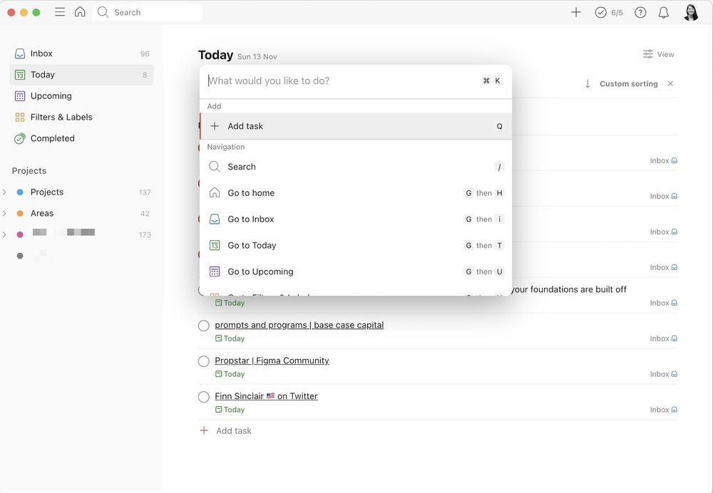
Todoist
Todoist is a popular task manager that puts a lot of emphasis on quick actions via keyboard shortcuts. You can see in their bar they’re using the space on the right-hand side of each action to remind users of keyboard combos.
Framer
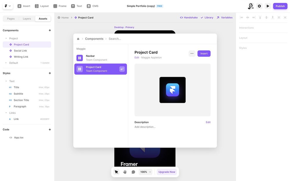
Framer is a design & prototyping tool. You can search for both actions and components, and it fittingly gives you a nice big visual preview. Their command bar is more graphical than most with colourful icons and buttons embedded inside it.
Tana
Tana is a new knowledge management app that puts a lot of focus on dynamic views and flexible data. Their command bar lets users access a huge range of advanced functionality you could never fit into a classic UI (without it turning into a C4D situation).
Here’s a demo of me using the command bar to quickly write a search query for all the books in my database, filtered for only ones marked “Unread”
This is a good example of how users can chain multiple actions together in command bars. Each selection in the bar moves you onto the next set of available choices.
Raycast
Raycast takes the concept of a command-bar-as-universal-interface to the extreme. The whole app is just a command bar. But it has access to your full desktop environment and integrates with most major applications.
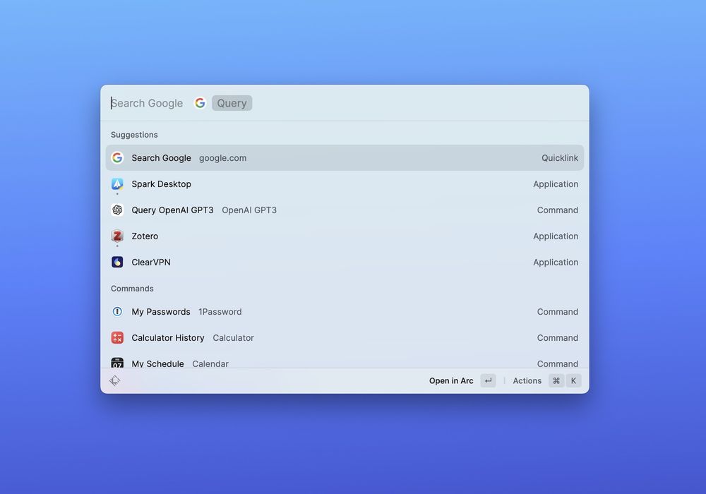
Think of Apple’s Spotlight feature, but if search actually worked and it could tap into all your other applications – Slack messages, Google drive files, GitHub PR, Figma files, etc. Raycast very cleverly designed the system to be extensible. Any developer can build a new extension for it, meaning there’s no ceiling to the number of actions potentially available in it.
Here’s a quick demo of me accessing Wikipedia, Spotify, Google, and even querying GPT-3 from the unified interface:
Lazy
Lazy is following the spirit of Raycast, but specifically for information capture and knowledge management. It’s a bar you can pull up in any context – twitter, an article, a youtube video, email – and natively capture key information into a personal database.
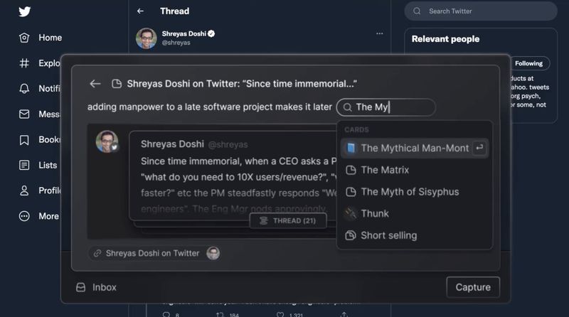
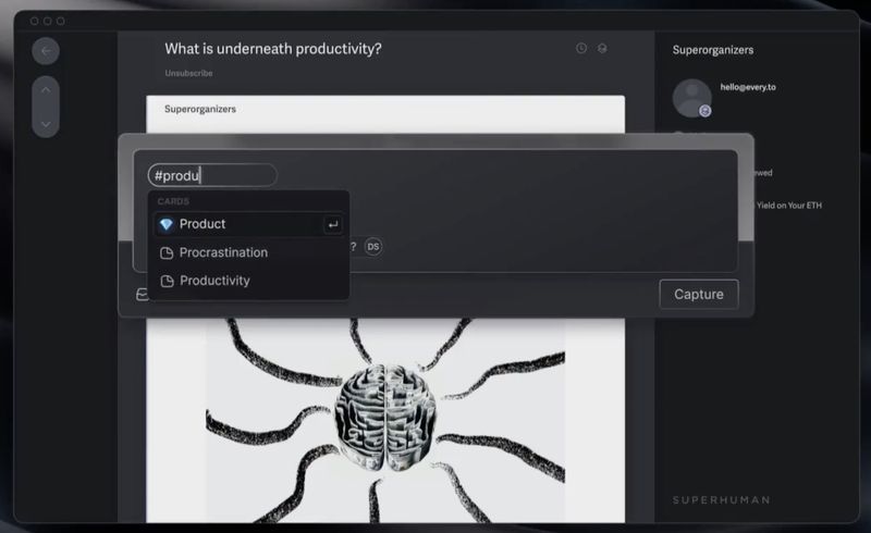
They’re still pre-release so you’ll have to settle for the fancy landing page and hype video .
The History
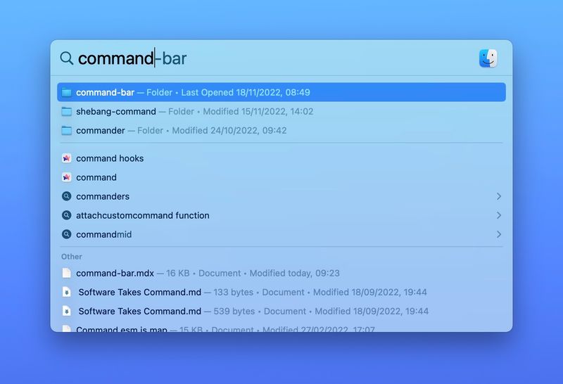
The origins of command bars go back to 200521ya when Apple released their Spotlight feature in MacOS 10.4 X Tiger. The update introduced a universal search bar you could launch by hitting CMD + Space. As part of the native operating system, it had access to every kind of file and function: documents, email messages, photos, settings, etc.
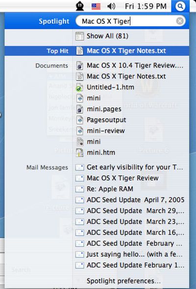
Spotlight is still a core feature of Mac today and set many of the standards for other command bars to copy.

Independent developers swooped in to build advanced versions of Spotlight and application launchers for Mac. Quicksilver was one of the earliest ones
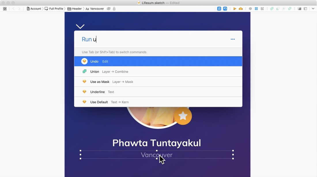
The plugin Sketch runner added a CLI experience on top of the once-popular design platform Sketch .
