Table of Contents
Table of Contents
Developers interested in design and illustration. Designers and illustrators interested in programming. Anyone who gets excited about metaphors.
This is a long, overdue case study showing how I make an egghead course illustration. It spans everything from cognitive metaphor theory to Photoshop rendering so I hope you have a hot, caffeinated beverage with you.
A Metaphorical Introduction
You are hereCultural and Linguistic Research
Lateral Thinking and Creative Play
Composition, Colour, and Completion
An Introduction
For the last half decade I’ve been the art director & lead illustrator over at egghead.
We’re a company / website / collection of humans who teach web development. We use a mix of tutorial videos, code challenges, articles, illustrated notes, workshops, and whatever other medium we feel like. As you might expect, it’s a whole lot of JavaScript, React, GraphQL, Vue, classic HTML & CSS, and other internety technologies.
It’s my job to take all those abstract, hard-to-explain programming concepts, and make them visible in a way that helps people understand. Sometimes through illustrations, or animations, or illustrated notes, or diagrams, or interpretive dance on zoom calls.
One part of that is making course illustrations, which are like album cover art for all the courses we publish.


So far I’ve made over 150 of these things, and I’m almost beginning to think I know what I’m doing. I don’t make all of our illustrations – I work with a rotating team of freelancers who help with the load. Lovely folks like Maxime and Aleksander have made plenty of them.
Part Zero – What are we doing?
The guinea pig for this case study is going to be Mike Sherov’s course on Web Security Essentials.
Here’s a quick overview of the course – it shows you how to protect a website against common attacks like man-in-the-middle interceptions, cross-site scripting, and cookie hijacking. All your classic internet foes.
The first step in starting a design task of any kind – illustration, innovative sandwich recipe, or carbon capture technology – is making the challenge you’re facing nice and clear. So let’s write ourselves a challenge statement:
Create an illustration that clearly communicates the idea of “Web Security”
That might seem dumb and obvious, but it’s surprising how easy it is to get off track without stating the goal up front.
At this point, it’s good to make clear that “Web Security” is not a single, physical, made-of-atoms-and-quarks object in the world.
Thus begins our problem.
How do you draw a thing that’s not a thing?
It’s a good question. One I’m slightly obsessed with.
Drawing well is difficult in its own right. Making a dog look like a dog or hand look like a hand requires a lot of training, practice and patience. It’s a whole extra challenge to figure out what the thing you’re going to draw is in the first place.
How do you take a fuzzy-edged, evolving cultural concept like “Web Security,” and condense it down to a single image?
The answer, in short, is a mix of cultural symbols and visual metaphor. Though there’s a little more to it than that.
Good, meaningful illustration works in four layers.
I like to think of it as a cake:

You start with a solid base of visual metaphor. Add on a layer of clear, well-constructed drawing. Then you think about designing an aesthetically pleasing composition with gestalt principals. And finally you throw fancy lighting and pretty colors over the top. Not an official theory of any sort - just IMHO. Feel free to email this to real illustration professors and PhD students so they can burn it on the sacrificial cross of correctness
Tool Talk
A whole lot of people ask about the whipped cream and cherries sitting at the very top of that cake.
“What app is that?”
This happens in every industry – the most visible top layer of any creation feels like the most important part of it. Asking what tool someone uses is a very logical and legitimate question.
So let’s get the tool talk out of the way. I’ve written a whole post talking about the hardware/software I use for various illustration styles. But here’s the quick version:

I do all my brainstorming and sketching in Procreate on an iPad Pro 12.5” Once I’m ready to make the final, I use a combination of Adobe Illustrator and Photoshop. My main machine is a Macbook Pro 2015. It’s hooked up to a Wacom Cintiq 22HD monitor that allows me to hand-paint in details.
These tools are certainly an integral part of making shit look cool (and I am very into making shit look cool). There’s inherent power in crafting precise shapes in Illustrator. Painting subtle lighting effects with blending layers in Photoshop is a joy. I don’t want to disregard the technical side.
But for most of this blog post I’m not going to focus on it. I’m not convinced telling you what pixel size I set my #EAEFF1 brush to while I careful render diffuse light across a reflective metallic surface like a pedantic perfectionist is helpful. If you would like to learn how to do the shiny lighting stuff, take Sam Neilson’s Fundamentals of Lighting on Schoolism. It will drown you in the minutiae of rendering light on surfaces.
Also check out the Resources page.
I will cover that workflow more in Part 4 of this series. But they’re not The Thing We’re Doing. Which is learning how to draw invisible things. So let’s get back to talking about the meaty stuff.
Part One - Making Metaphors
Let’s start at the bottom of the cake with Metaphors.
Metaphors are fundamental to how we visualise anything that’s a non-physical, abstract idea.
Drawing an orange is fairly straight forward. Drawing freedom, financial crashes, racial tension, teamwork, speculation, database management, capitalism, or productivity all relies on metaphor.
So, what’s a Metaphor?
The first step to getting good at metaphor is understanding what it is.
Let’s make sure we’re all on the same page:
A metaphor is when we understand one thing in terms of another.
The power of metaphor is it helps us use something we know to understand something we don’t know.

We may not 100% understand Thing B. But we know enough about Thing A, and can map its qualities onto Thing B. Which at least gives us a starting point.
I can tell you a quantum computing bit is like a spinning coin that is neither nor heads or tails, but kind of both. And now you’re 1% closer to understanding how a quantum computer works.
Sometimes we actually know a lot about Thing B, but thinking about it in terms of Thing A gives us insights we never realised before.
In metaphor nerd terms we call Thing A the source and Thing B the target. The source is like a frame that we look at the target object through.
It “frames” how we see Thing B.

Just like a window frame, the source frame gives us a limited view of the world. Anything outside the frame get hidden, while anything within the frame gets highlighted.

Qualities that both the source and target share are highlighted. While qualities they don’t share are hidden away outside the frame.
Let’s look at an example of this in action.
We often talk about time through the metaphorical frame of money.
That delayed flight cost me an hour.
Can I steal a few minutes of your time?
I don’t know if spending all day on that is worth my while.
The way we speak about time shows we project the qualities of money onto our idea of time.

Our Time is Money metaphor highlights the qualities of time that overlap with money:
- Time is a quantifiable substance we can count
- Time is a valuable, limited resource
- Time is a something we can give to, and take from other people
There are plenty of time’s qualities hidden by the frame of money. Unlike money, we all experience time as a relative, amorphous flow. It shifts form and length based on where we are, who we’re with, what we’re doing. One minute in a freezing cold shower does not feel the same one minute in the midst of a deep Netflix binge. One minute is not one minute in the same way one pound is one pound. Our metaphors are also deeply cultural, rather than being “natural” or “inherent.” They emerge in particular historical times and places, and serve particular purposes and particular people.
There are plenty of cultures where time isn’t thought of in this kind of rigid, segmented, and quantifable way. It’s firmly rooted in the historical context of a Western, post-Enlightenment, Capitalist society.
Money isn’t the only metaphor for time. We also compare it to a moving object when we say “that hour flew by,” or a container when we say “tomorrow is pretty full.” We’re perfectly capable of using multiple, overlapping metaphors for a single concept. And we’re able to switch between them without confusing ourselves. Very handy.
Which metaphor we pick depends on what qualities we want to highlight or hide. We focus us on what’s important about the target, and downplay irrelevant details.
This is why metaphors are so good at explaining complex ideas. We get fine-grained control over what’s most important about the concept, and cut out all the noise.
Beyond just being useful for learning complex concepts, and framing old ideas in new ways, metaphor is the basis of nearly every thought we have. It’s a fundamental building block of human cognition that shapes the way we percieve and interact with the world. This goes a bit too deep to elaborate on here, but Cognitive Metaphor Theory is beautifully mind-blowing and worth exploring when you have time. A good starting point is the book Metaphors We Live By written by George Lakoff and Mark Johnson. TLDR, they’re more important than you think.
Programming the Metaphors
Metaphorical thinking is especially useful when we’re trying to explain and illustrate programming concepts.
The kind of topics we teach at egghead are always:
a) fundamentally abstract
b) haven’t been around long enough for our culture to develop a set of meaningful icons and visual symbols for them
Try, for a moment to imagine what “Typescript with React” visually looks like. Or “A Server-rendered ReactJS Application with Next.js”. Or the “State Monad in JavaScript”
Not exactly a vivid picture in your mind, right?
This is partly because programming is an abstract activity. It has to be.
Taken literally, programming involves running enormously complex sequences of electrical currents. On a microscopic scale. Inside our machines.
That world isn’t human friendly. We can’t see what’s going on or control what happens without a thick layer of symbolic software in the middle.
So we invented programming languages.
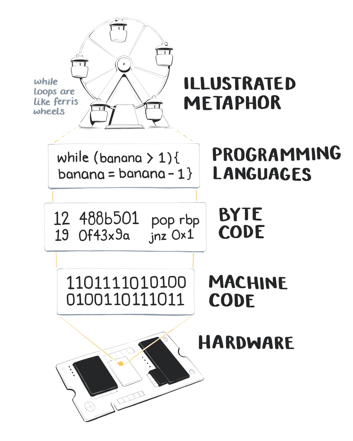
The JavaScript snippet let fruit = banana maps onto a specific set of electrical pulses firing deep inside your hardware.
In programmer land this is called an abstraction.
Funnily enough, it also fits our definition of a metaphor. Programming is just a giant stack of metaphors. Each layer of the metaphorical stack moves us further away from machine world, and closer to human world. Here’s a terribly nerdy MIT PhD thesis about it if you want to go down the rabbit hole… Programming with Agents: New metaphors for thinking about computation
Illustrated metaphors that capture the main idea of a programming concept are just one more addition to the top of our human-friendly stack.
Learning to Metaphorically See
Now that you’re thoroughly soaked in trippy metaphor theory, let’s bring it back down to earth with some familiar examples.
One way to hone your metaphor-making skills is to explicitly notice when you’re seeing one. We process metaphors automatically and unconsciously. Which means it takes a little effort to consciously understand how they work.
Let’s take another look at some of these course illustrations, and work backwards to break down each piece of the metaphor.
I’m going to use the 🎯 emoji to label targets, and ⛲️ to label sources.
Advanced CSS Selectors
The webpage 🎯 is a customisable house ⛲️. Individual elements on the webpage 🎯 are different parts of the house ⛲️. Selecting web elements with specific CSS styles 🎯 is selectively painting parts of the house various colors ⛲️Yes, this whole metaphor is taking place inside a game of The Sims
Reduce Redux Boilerplate with Redux-Actions
Redux 🎯 is the 197848ya arcade game Space Invaders ⛲️. The Redux-Actions library 🎯 is a combination of the joystick, and the two tiny spaceships it controls ⛲️. Boilerplate redux code that we want to get rid of 🎯 is an army of space invader aliens, being zapped into oblivion by the Redux-Action spaceships ⛲️. Journey with Vue-Router
Vue-Router 🎯 is an underground railway system with train carriages travelling along it ⛲️. Each page in a Vue application 🎯 is a station ⛲️. The user clicking between pages 🎯 is riding the train between stations ⛲️. Building new routes between pages 🎯 is laying down new train tracks and between stations ⛲️.I know this is a little like telling a joke, and then explaining why the joke was funny. It kind of sucks the fun out of it.
But breaking down visual metaphors helps train your mind to consciously see how they’re built. You stop operating on autopilot, and understand there’s a logical process in moving from abstract idea to concrete visual.
I keep a giant collection of these for reference. Every time I spot a terribly clever editorial illustration or advertisement, it goes in the file.
Two illustrators I consider the cream of the metaphorical crop are Emiliano Ponzi and Matt Chase. Take a look at a few of their creations:
Matt Chase
Political Hobbyism
Polticial action 🎯 is a speaking through a megaphone ⛲️. Hobbyism and passivity 🎯 is lounging around on the couch ⛲️.

Emiliano Ponzi
Snake Oil Job Training for Midlife Career Changers
A career 🎯 is a journey along a road ⛲️. Facing trouble on a a career journey 🎯 is a the road turning into a wall ⛲️. Snake oil training services 🎯 are a road running upsidedown and backwards ⛲️.

Matt Chase
Prolonged Prosecutions in Guatemalan Courts
The justice system 🎯 is a set of balance scales ⛲️. Prolonged and corrupt court cases 🎯 are a tangled mess ⛲️.

Emiliano Ponzi
The Art of Improvisation
A challenge 🎯 is a maze ⛲️. Following the traditional rules 🎯 is getting to the centre of a maze by walking between the hedges ⛲️. Improvisation 🎯 is getting to the center by mowing a path through the hedges ⛲️.

Knowing how to build a good metaphor isn’t only useful for illustration.
Metaphors come in many forms. You can write metaphors into tutorials and documentation. You can explain a piece of technology to a non-technical co-worker. Or you can finally find a meaningful way to tell your mother what you actually do for work (other than “computers”).
In Part Two I’ll dive into more specific techniques for creating metaphors.
We’ll cover how to do cultural and linguistic research to find existing metaphors. We’ll also work through building new metaphors by focusing on core qualities of a concept, and using lateral thinking to generate alternative solutions.