“What app is that?”
I get asked this question at least once a day on Twitter. People are always keen to hear what tools I use to make illustration. It’s frankly daft it’s taken me this long to just write a note about it rather than answering a thousand people individually.
I’m a Promiscuous Polytooler
I use wide variety of different tools and apps for different kinds of visual creations. I’m not wedded to any one tool in particular – they all have their strengths and weaknesses. I’ll use whatever fits the task at hand and move work between them liberally.
Here’s all the apps and hardware that might be involved in a particular creation…


Workflows
And here’s a couple of my common workflows for different styles of illustrations and visuals…
1. Illustrated notes
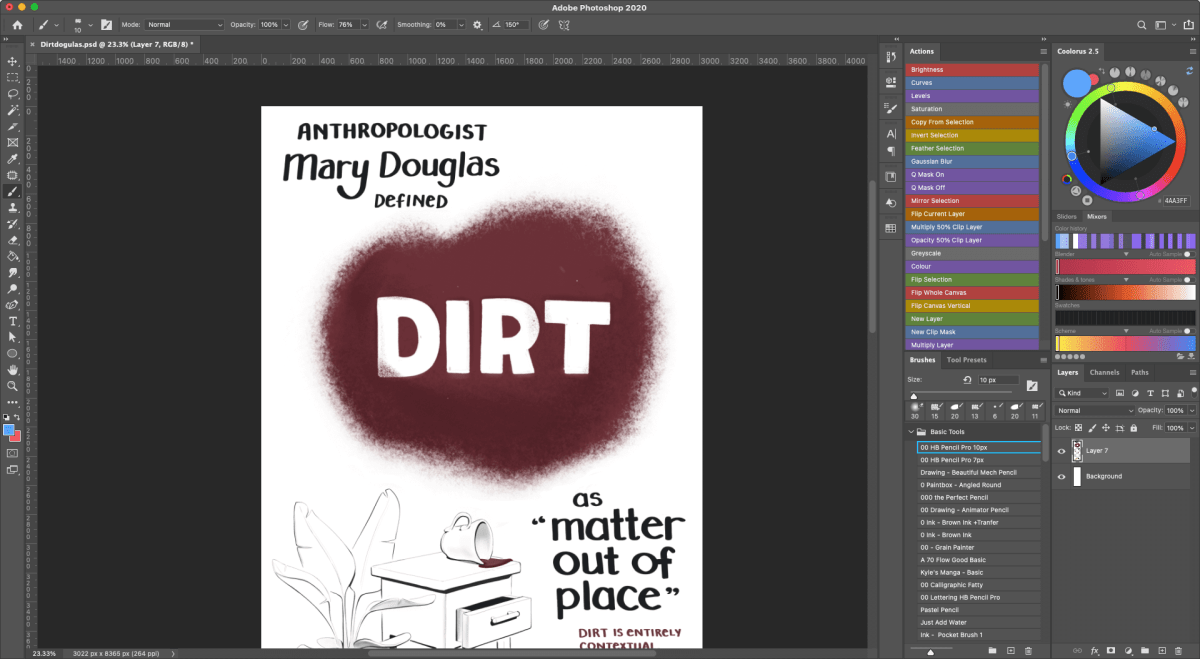
Anything I make that has a painterly and loose hand-drawn feel was made in Procreate on the iPad or Photoshop on the Wacom Cintiq. Or probably a combination – it’s easy to move files back and forth between the two and the tools they offer are very similar.
Illustrations like these…
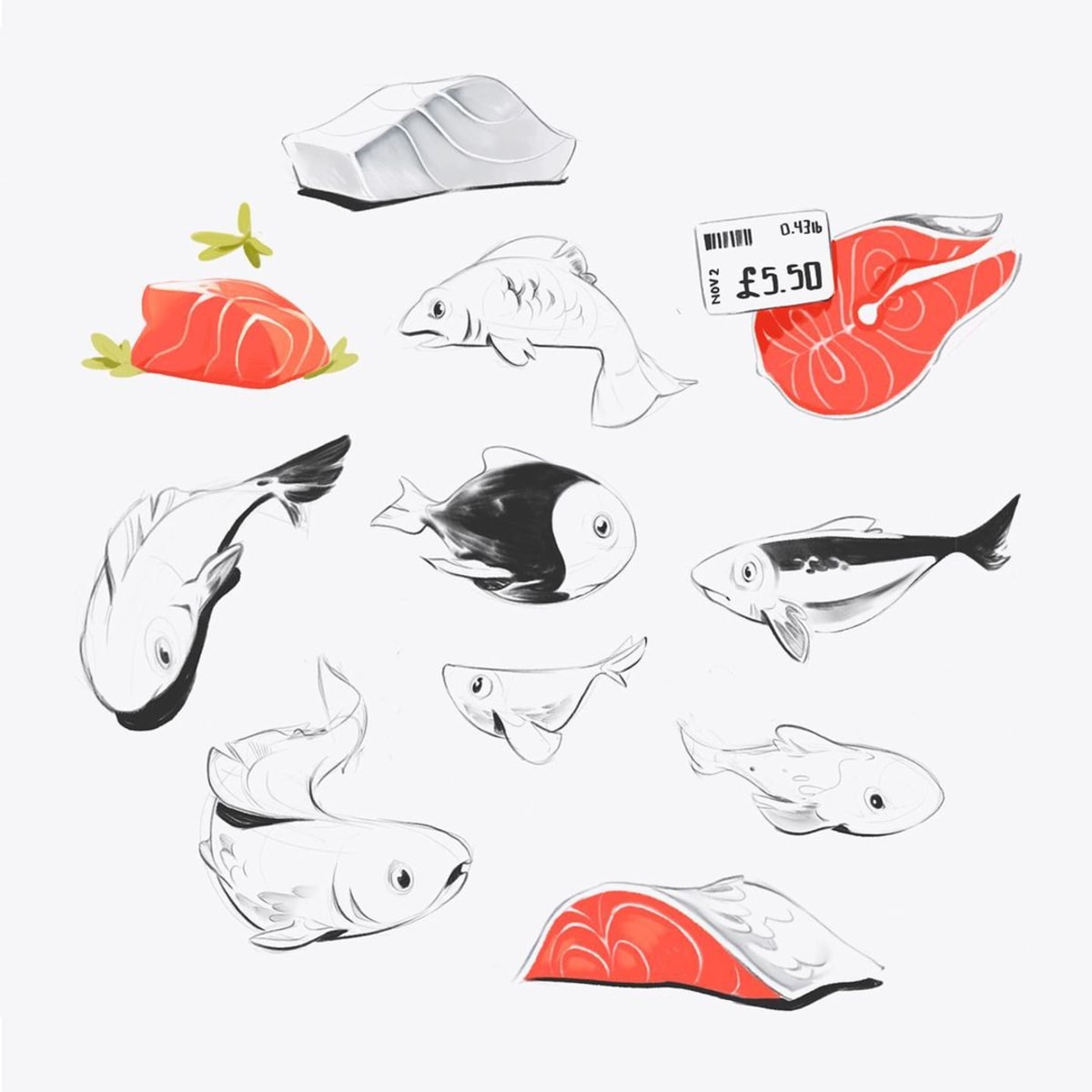


Both of these applications allow you to draw in “raster” graphics, meaning you paint pixels onto a canvas. They require a decent level of hand-skills to make sure your lines aren’t wobbly, although both applications have smoothing features to help with that.
When I’m in Procreate I use a small selection of brushes I’ve gathered over the years. It’s hard for me to remember where they’re all from, and I’ve customised the majority of them to suit my personal prefs. Most of them were originally from Max Ulichney’s MaxPacks brushes. I have the essentials set ($2), the painters set ($8), and the comics set ($15), and can vouch they’re all great.

I move these pieces to Photoshop if I want to work on a larger screen, or have accidentally enlarged the canvas to a 14000px wide sprawling set of sketches that Procreate can’t open without crashing.
2. Polished vector illustrations
Illustrations that look more “polished” are made primarily in Adobe Illustrator, with a touch of Photoshop at the end for lighting effects and texture.
Pieces like these…

These illustrations are all vector-based, meaning we use mathematical curves to define their shapes, rather than painted pixels. Vectors are great for create hard, crisp edges and working with perfect geometric forms.
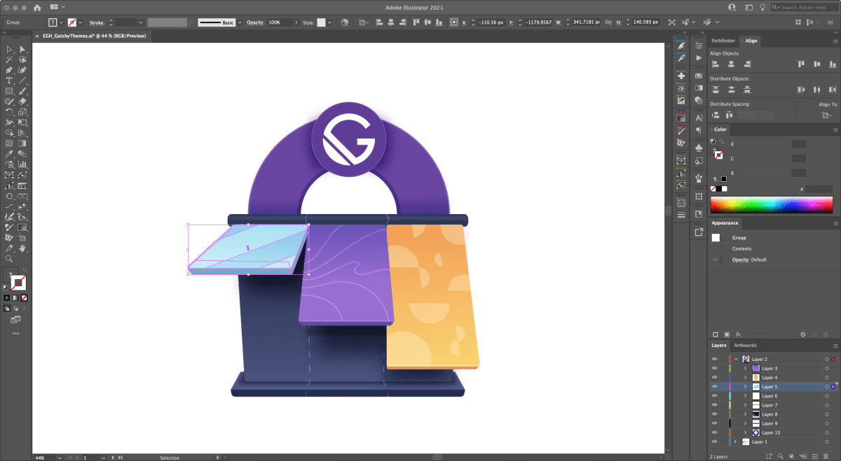
While I love vectors for laying down the foundation shapes of these, I’ll move them over the Photoshop once they’re 90% done to adjust the colors, add more subtlety to the lighting and shadows, and chuck a bit of texture on the top so they feel more tangible.