Developers who are familiar with modern programming interfaces and tools. Ideally JavaScript, but not necessarily.
This talk – “A Picture Worth a Thousand Programmes” – is an exploration of why we don’t use more visual explanations and embodied knowledge in our programming tools.
I first presented it at React Advanced London in 20215ya . You can watch the recording on the official conference website:
Or if you prefer words, you can find the written version below.
Transcript and Slides
This is about making pictures. Specifically, making pictures of programmes. Ideally pictures worth a thousand programmes, as the traditional saying goes.
I’ve spent my whole career so far creating visual representations of programmes.
During my time at egghead I made hundreds of cover illustrations for the courses we taught.
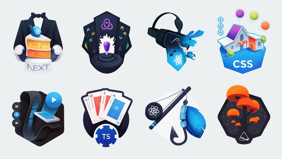
Each of these would start with an abstract programming concept that I had to find a way to visually represent in a single image
I learned to rely heavily on visual metaphors for these. Styling with CSS became painting a house. And became organising types in typescript became sorting suits in a deck of cards.
I’ve also made a lot of illustrated diagrams over the years to explain topics like how JavaScript prototype inheritance JavaScript Bits You Skipped the First Time Around
Illustrated notes on advanced but fundamental topics in JavaScript works, or what happens when you flatten an array, or how APIs Meet the Robowaiter APIs Serving Us Data
Everything you need to know about what API's are and how they work are like small robotic waiters.
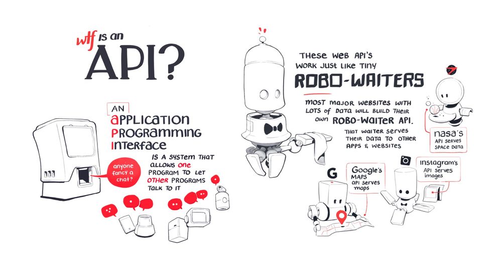
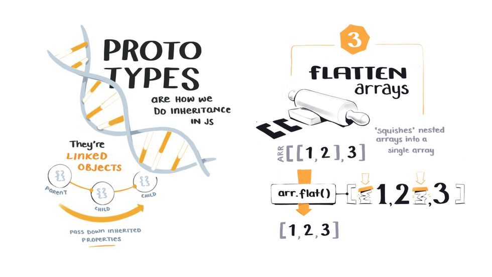
The goal of all these illustrations is to make complex technical topics relatable and easier to understand, a theme you’ll hear a lot about in this talk.
I also recently collaborated on a project called Just JavaScript with Dan Abramov
It’s a JavaScript course that teaches the core mental models of the language through visual diagrams and animations.
We worked together to develop a visual language that was a bit more formal than the previous illustrations I showed.
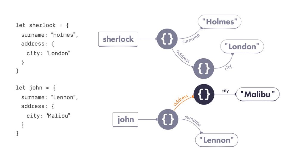
Every piece of syntax correlated to a specific visual shape, and we used the system to explain concepts like assigning properties and object mutation.
Now, I’m not running through all this work to show off – I just wanted to give you some context around the kind of programming visuals I’ve made in the past so you have a sense of what I mean when I refer to ‘pictures of programming’.
In going through this process of transforming programming concepts into visual images hundreds of times, I’ve been forced to think a lot about the way we represent and communicate complex programming ideas.
And I’ve come to believe visual representations have a lot to offer us over here in the land of code.
In this talk I’m going to show you how visuals can make programming concepts:
- less abstract
- easier to understand
- more accessible to more people
I’m also going to show you why visuals are so special. And it turns out to be relatively simple…
Visuals bring invisible, abstract programming concepts down into the embodied world.
The embodied world is where you and I live. Everyone watching this talk has a body. And you use it to interact with physical objects around you, move through space, and experience events over time. Everything you know about the world is mediated through your body, and this fact is so fundamental we sometimes completely forget it.
And programming concepts are abstract ideas that do not live in the embodied world here with us.
They’re imaginary objects and functions… that exist in a liminal space that feels like it doesn’t obey the same laws of physics that we do.
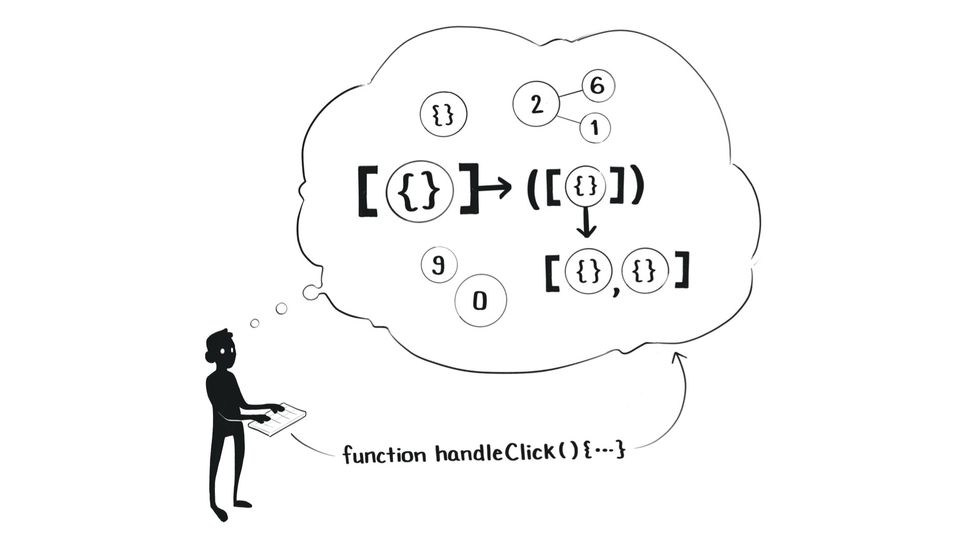
And we can only interact with them through this disembodied experience of typing linear text instructions into a code editor.
This is precisely what makes programming so difficult. We’re trying to reason about and work with things we cannot see or touch when we are creatures who are evolutionarily adapted to function in a highly visual, spatial, physical world.
And I think visuals are a big part of bridging that gap between our embodied human world and the disembodied machine world we’re all trying to programme in.
So here’s the plan. We’re going to explore this topic through three questions:
- ‘What’s wrong with text?’
- ‘What can visuals do that text can’t?’
- “Haven’t we already tried this?”
After all, there are no new ideas under the sun. Many, many people in the past have explored ways to make programming more visual. We’re going to look at what’s already been tried, and what opportunities still lie ahead.
I. What’s wrong with text?
This is an important question to ask because almost everything we do in programming is expressed in text.
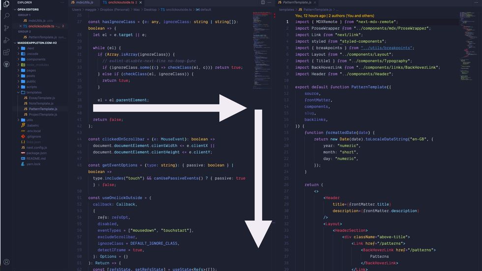
This is how every app you’ve ever worked on looks. Text is arranged in lines going from left to right and top to bottom.
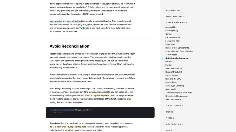
Here’s every documentation website you’ve ever read
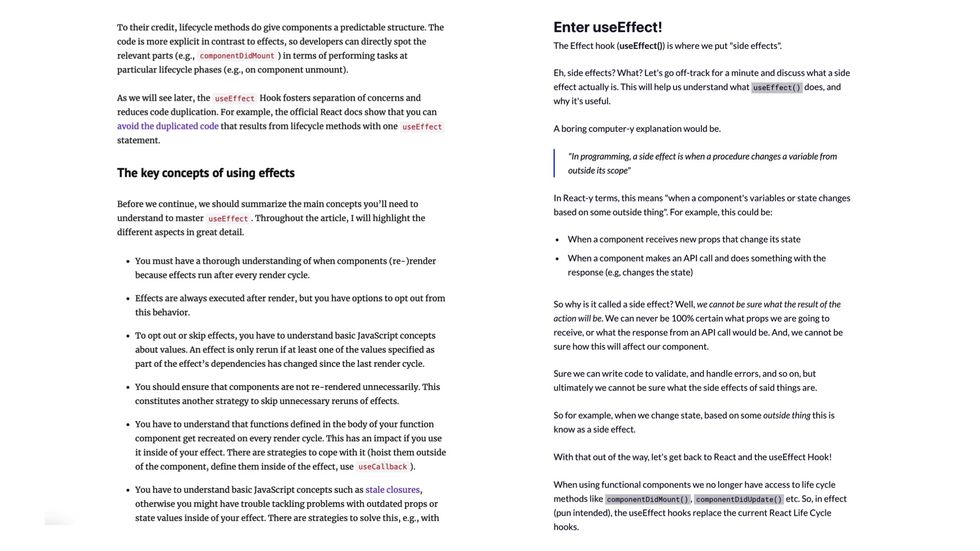
And here’s every blog post you’ve ever learned from.
All of our current programming languages, tools, interfaces, and documentation are overwhelmingly text-centric.
You sometimes get a diagram here and there, but it’s slim pickings.
If I had to guess the balance of text to visuals in our industry, I’d bet we’re at 98% text to 2% visuals.
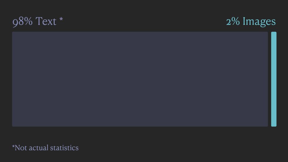
I haven’t done any official surveys on this and I couldn’t find anyone else who has, so this is just based off my personal experience in the web development community.
If you take a minute and think over all the code and documentation you encounter on a daily basis, I’m betting you land on a similar estimate.
If we look at the history of programming, it’s fairly clear how we ended up in such a text-heavy world.
This is a computer circa 197056ya . You’ll notice the lack of a screen.
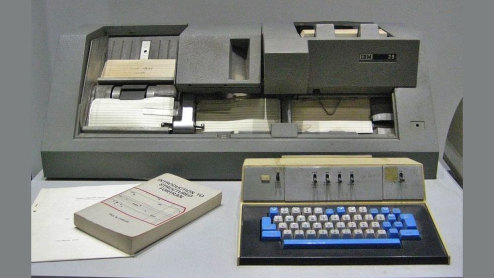
You had a keyboard and a stack of punchcards, and the only thing you could do was type linear text to create programmes.
This design constraint meant all our early programming languages were text-based. And once you establish the text as the primary paradigm of a field, it becomes hard to break away from. Especially in an industry where we rely so heavily on lower-level abstractions created by all the programmers who came before us.
There are also plenty of logical reasons why we rely so heavily on text in programming. Written words and syntax are ideal mediums for expressing abstract logic.
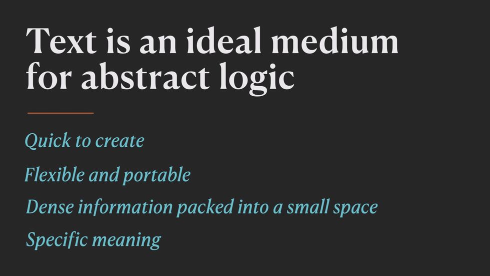
- It’s quick to create
- It’s flexible and it’s easy to move between applications using copy and paste without worrying about compatibility.
- You can pack a dense amount of information into a very small space
- You can be very specific about what you mean, which obviously matters when we’re talking to computers who have no sense of nuance.
So far text has been working great for us in programming.
But some of text’s greatest strengths are also its greatest weaknesses.
The abstract nature of text is what removes it from our embodied experiences in space and time.
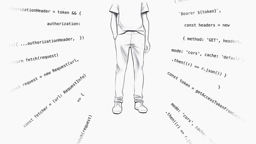
When we write code, we’re writing a set of hypothetical instructions to run on someone else’s machine at some point in the future, in a time and place we’ll never know about.
This level of abstraction removes the physical, spatial, and embodied qualities that humans rely upon to understand the world around us.
This can be good in some ways. When we write a function like fetchUserData() we don’t have to define its size, shape, or colour of it. It’s just a simple function floating in machine land.
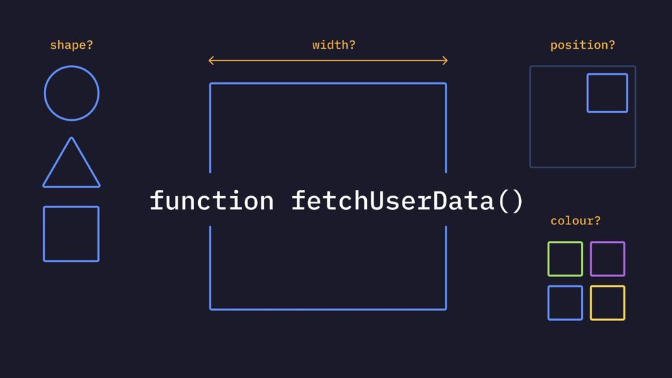
If you already know what this function is and how it works and where it located, this level of brevity is great.
But imagine someone new to programming who has never written a function to fetch user data, and has no pre-existing mental model of how it might work.
One of the easiest and most effective ways to make it comprehensible to them is to explain it in familiar terms…
by using physical qualities they already understand like size, shape, colour, and spatial relationships.
This might give us something like this to help explain what a fetchUserData function does.
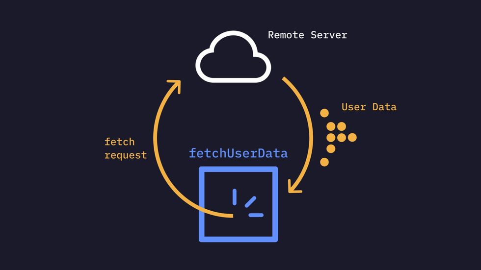
The visual doesn’t have to be crazy complex or beautiful. Boxes and arrows work great. We’re certainly allowed to use text labels to make the imagery clear.
Visuals let us use our pre-existing embodied knowledge to show how programmes work in a way text can’t.
II. What can visuals give us that text can’t?
I think visuals reveal three aspects of programming that we’re unable to see in text.
- They reveal fundamental metaphors embedded in our programming languages.
- They reveal spatial mappings that we use to reason about how our programmes are structured and how data moves through them.
- They reveal how our programmes and data behave over time.
These things all are implicit in the programmes we write, but not things we can explicitly show in the medium of linear text.
Visual mediums reveal metaphors
Let’s start with metaphors
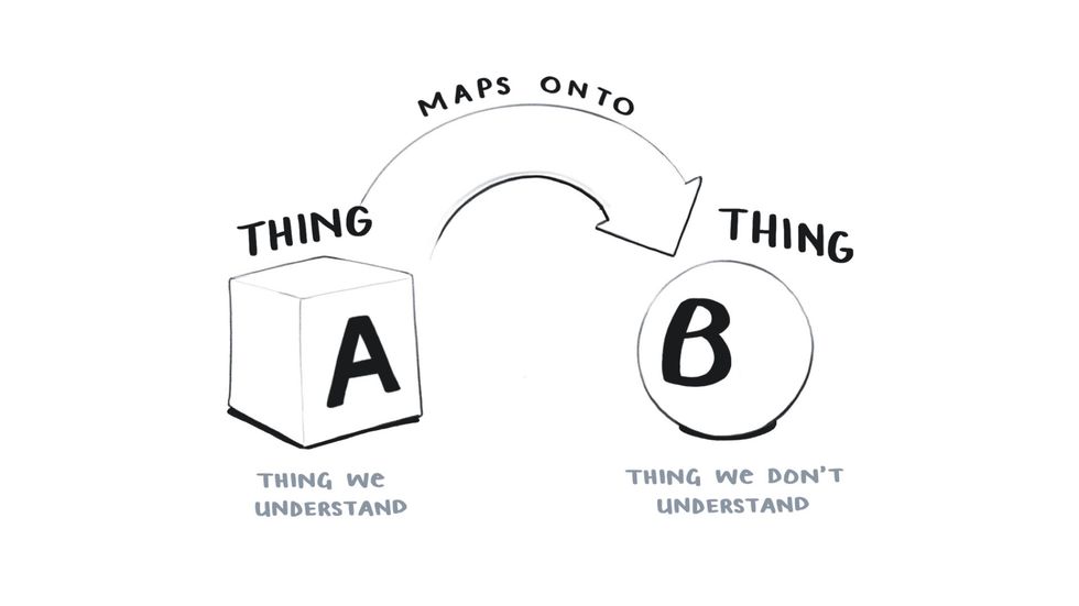
Just to make sure we’re all on the same page, let’s establish that metaphors are thinking tools that allow us to understand one thing in terms of another.
So let’s say we have Thing A here which we understand and Thing B which we don’t.
And to help us understand Thing B and get a general idea about what it’s like and what it can do, we map the qualities of Thing A onto it.
If we say corruption is a disease, we understand that corruption spreads, is difficult to overcome, and if left unchecked, can kill.
Similarly, we often say life is a journey. There are many paths our lives might take, they vary in length, and they all have a beginning, and a final destination 💀.
Now when I talk about metaphor in the context of programming, I don’t mean the creative, fanciful metaphors you find in poetry and parables like taking the road less travelled or wandering lonely as a cloud.
Those are called figurative or poetic metaphors. They’re the sort we’re warned not to use in technical tutorials since elaborate, poorly chosen metaphors can be more confusing than helpful.
I’m talking about a much more fundamental type of metaphor that lies at the heart of all abstract thinking, including programming.
These are called cognitive metaphors since they enable cognition on a much deeper level.
These cognitive metaphors are based on our embodied experiences of the world.
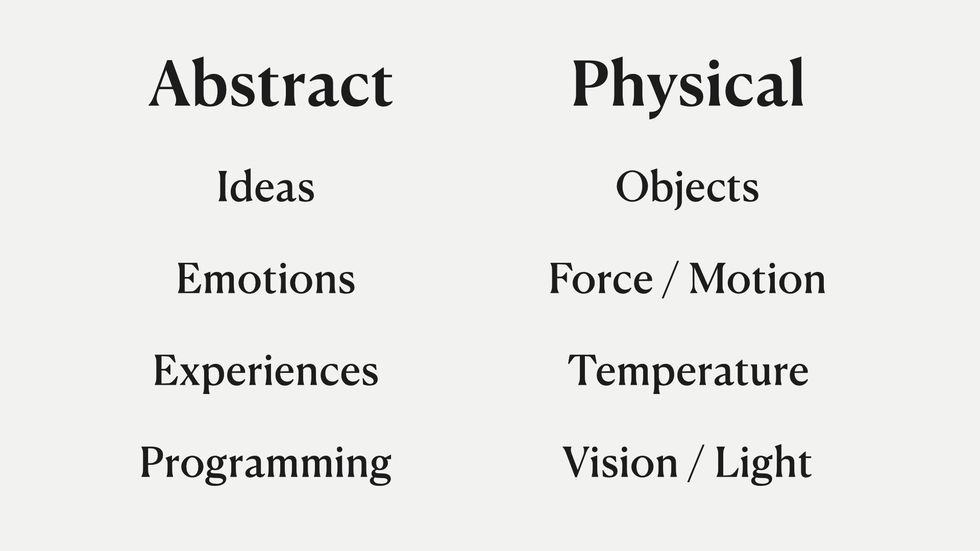
We have all these non-physical things we need to communicate to each other like emotions, thoughts, ideas, and programming concepts.
And to understand them and talk about them, we use our experience of the physical world around us as a metaphor.
If you look at the way we talk about abstract things, this becomes obvious….
- We talk about ideas in terms of light when we say “that’s a bright idea” or “that illuminates the problem”
- We talk about emotions like they’re objects. We say “he hid his jealousy” or “she doesn’t handle anger very well”
- We can also use force and motion metaphors to describe experiences like “I found your talk moving, it touched me”
- We talk about programming ideas in terms of temperature like hot reloading in React or how the JavaScript landscape is heating up
This isn’t a theory I’ve just come up with on my own.
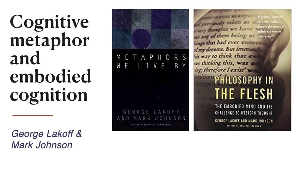
These principles come from the field of cognitive metaphor and embodied cognition. They were first developed in the 1980s by George Lakoff and Mark Johnson who since have written numerous books on it, and it’s become a major area of research in cognitive science.
These books, Metaphors We Live By and Philosophy in the Flesh are two of the major texts.
So I can’t go too deep into this now, but if you’re curious to learn more these are worth checking out
Just like every other abstract topic that we can’t see or touch, programming relies heavily on these physical, embodied metaphors.
We have to because programming itself is a game of abstractions. When we run a JavaScript file, what we’re really doing is telling a microchip to flip a bunch of logic gates using tiny electrical pulses.
Programming tiny logic gates is very tedious and difficult for humans to do.
So we’ve developed a stack of elaborate metaphors that it faster and easier.
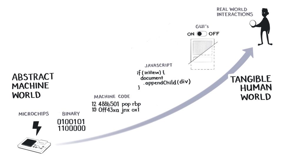
Some people might prefer to call these abstractions, but for the purposes of this talk, assume metaphors and abstractions are roughly the same things. We can debate the differences later on Twitter.
We simplify our binary code into machine code, which is simplified into higher-level languages like JavaScript, which we simplify with GUIs.
And at every step of this process, we’re trying to make the abstract machine world resemble our tangible, human world.
Because the closer we move towards intuitive, embodied knowledge in the upper right-hand side of this scale, the easier it becomes for us to understand what’s happening in a system.
Components in React are a great example of one of these embodied metaphors in action.
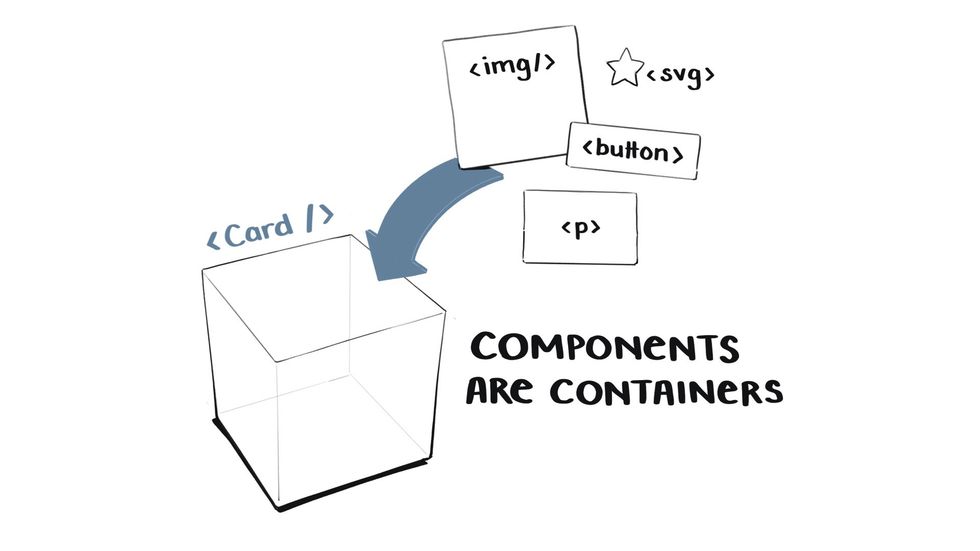
Components are essentially containers – they hold sets of UI elements for us.
So a card component might have an image, a button, and a paragraph inside of it that it holds.
Now the CPU that’s eventually going to render this component on the screen knows nothing about containers. It only knows machine code and how to make the right pixels light up.
The container is a metaphor that we humans need to manage and organise the code we write.
The only reason you know what a container is is that as a child, you dumped sand into a bucket and poured it out again. This interaction with the physical world, of learning through embodied experience, taught you that containers hold things. That they have insides and outsides. That they have boundaries.
All of these concepts are essential for you to understand how components work in React.
Let’s take another one. In React we structure our components in a hierarchical tree, where everything is connected back to a single root component.
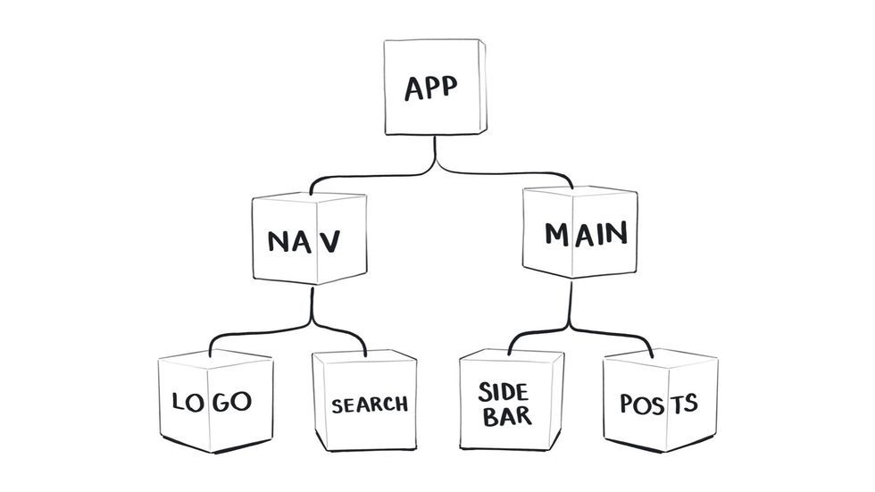
You know what a tree is from seeing thousands of trees.
And you get that they have many branches that spread out from a single root. An understanding that allows you to work with component trees in React.
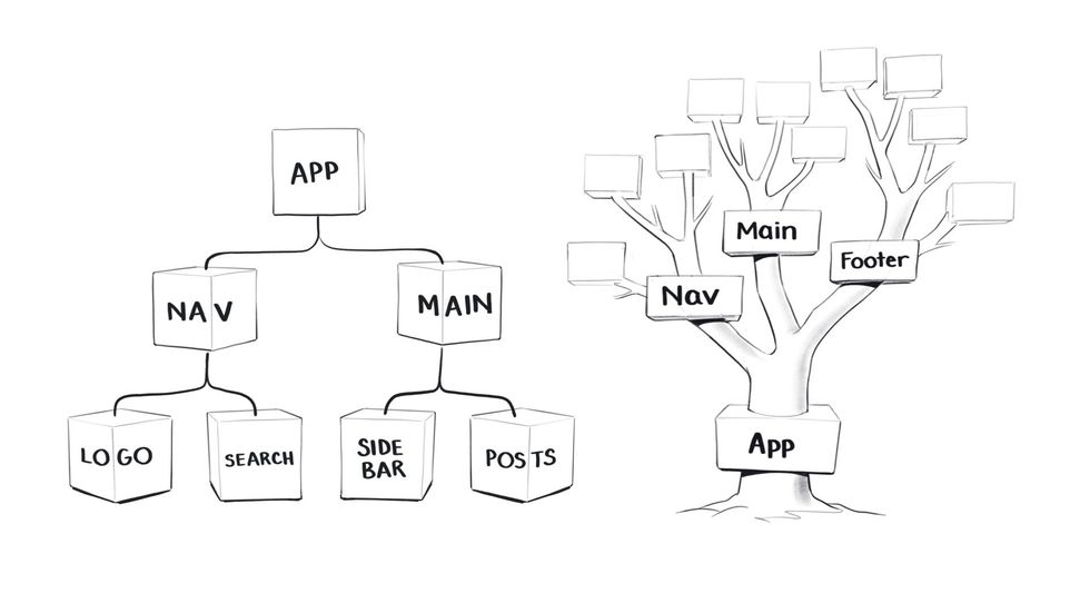
The React tree metaphor is actually a double metaphor since it’s also based on the idea of a family tree.
We have parent and child components that are inherent props in the way children inherit qualities from their parents.
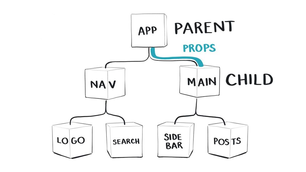
These are concepts we’re borrowing from the human world to interact with machines in a way that is easy and natural for us.
And you can probably see where I’m going with this.
Since your understanding of React is based in your pre-existing knowledge of the physical world around you, it would help if we could make that explicit in the way we represent and explain React.
And visual mediums allow us to do this.
You could certainly read about React component structures and passing down props, You would then form a mental image in your head based on your understanding of physical trees and family inheritance, and then apply that knowledge while you’re writing code, all without explicitly seeing it visualised.
But this is called making it harder than it has to be.
Visual mediums reveal space
As humans with bodies we inherently understand a large array of spatial concepts like up, down, left, right, in, out, big, small, deep, shallow, etc.
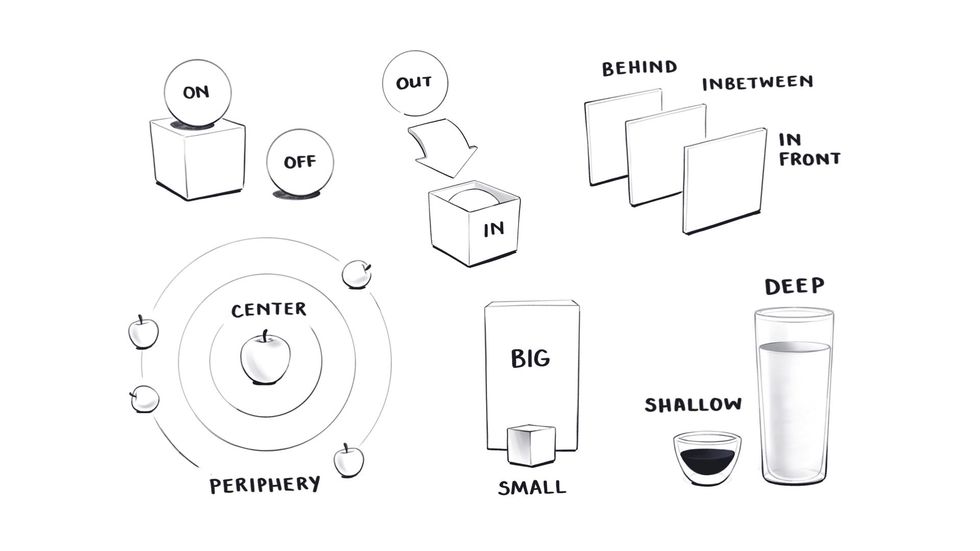
And just like we use metaphors based on physical objects to understand our programmes, we also use this knowledge of physical space to talk about the structure and behaviour of programmes.
If you think about the way we talk about the internet, there are very clear physical directions to it.
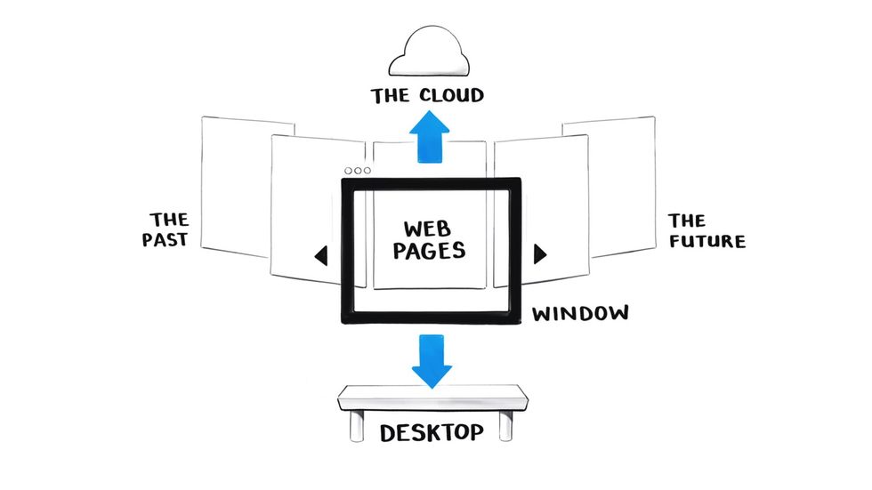
We upload data to the cloud above us and download files to our desktops.
We look through a browser window.
We browse webpages moving from left to right. So pages we’ve visited in the past are to the left and pages we’re going to in the future are to the right.
This format is also based on our western cultural mapping of time to space where we always draw the past on the left and the future on the right. But not all cultures do that.
Specifically in React, we use our understanding of vertical directions to think about how data moves.
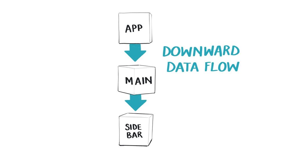
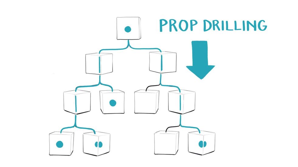
React has a hierarchical order of components – parent components are above children and pass data downwards. This means I guess we also have gravity in Reactland.
The idea of Prop drilling is another one that suggests we’re drilling downwards, in order to pass data deep into the tree so it also has depth.
When we talk about side effects we’re using our understanding of there being a centre and a periphery where things happen on the side.
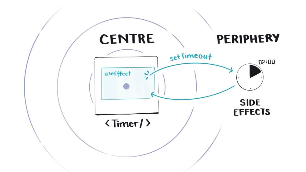
So when we run a function like a setTimeout inside a useEffect hook, we understand it’s accessing something outside of that central component.
I could go on with these. Our apps have front-ends and back-ends. We shallow merge objects. You get the point. We use spatial principles from our embodied experience in the world to talk about and understand React.
When we create visuals that show these spatial principles explicitly, it clarifies what we’re already doing in our heads.
Visual mediums reveal change over time
When we’re working in a linear text editor, time is essentially invisible.
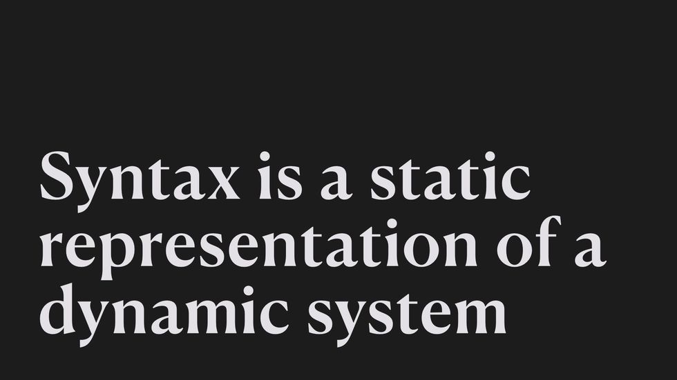
We’re looking at a static representation that describes a whole array of future events that may or may not happen, depending on what button a user clicks or whether our data requests resolves.
We’re forced to use our imaginations to predict what’s going to happen in all those potential futures, rather than being able to see it in some form.
Our current best technique for trying to see how things change over time is console logging data along the way.
But console logging feels like trying to get a programme to send signals up to the surface of a dark ocean where everything is being executed out of sight.
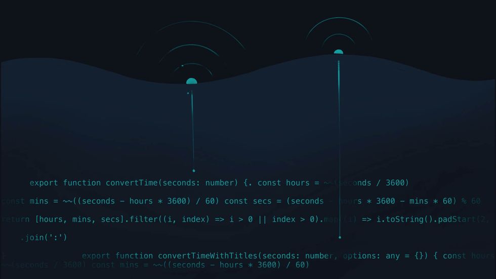
We can’t see anything happening down there, and we just have to keep asking for clues on how the data is changing.
Which doesn’t feel like the best developer experience.
This is again where visuals might come in handy because they allow us to see multiple points in time within a single frame.
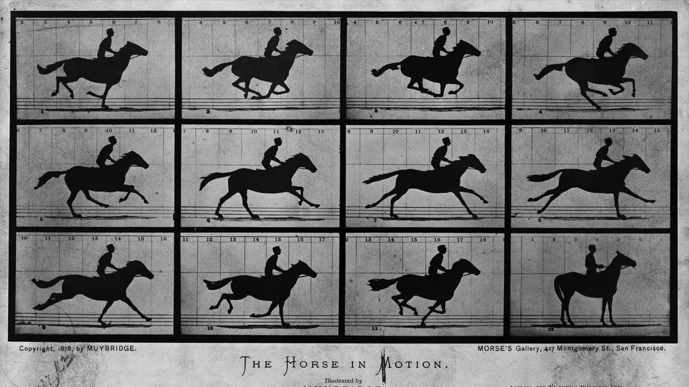
This lets us compare things side by side in a way that we can’t with linear text. They essentially allow us to play spot the difference.
Let’s look at the syntax for the useEffect hook as an example of this.
Here are four different versions of a useEffect hook which are each going to behave differently when they execute in the browser.
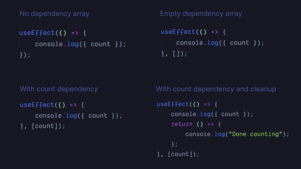
- The first has no dependency array
- the second has an empty one
- the third has the value count as a dependency
- the fourth also has count as a dependency and a cleanup function.
By just looking at these four versions of syntax, do you have any way of knowing how this function is going to behave once it loads into the browser? Specifically, do you know how often it’s going to be called and when?
Given the demographics of this audience I bet you do know, but it’s because you’ve memorised the syntactical meaning here, rather than knowing because the answer is visible in the syntax.
What we need to do here is compare four things that behave differently over time.
So the best way to do that is to visually show what changes over time.
I’ve made a simple set of diagrams that try to show the difference between these four on a timeline.
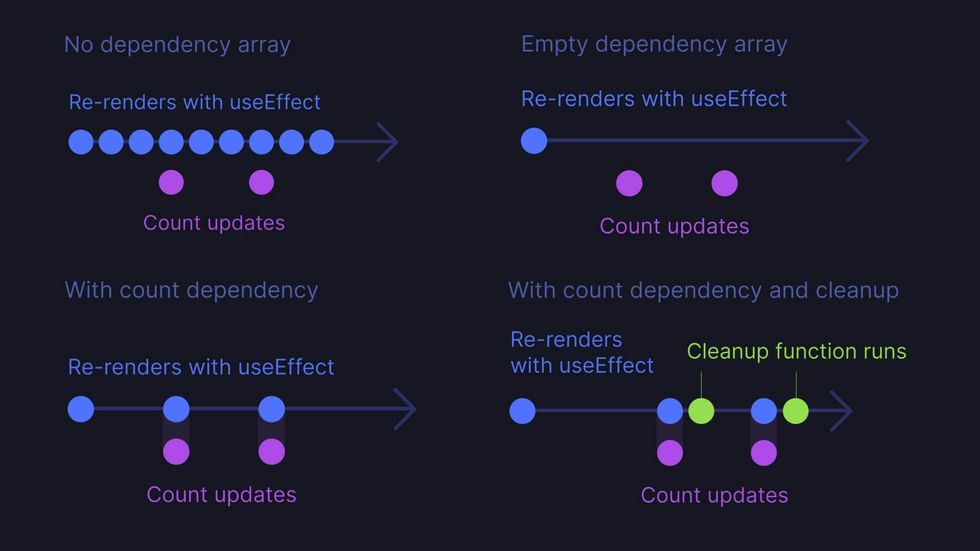
- Our first version with no dependency array. The useEffect function is called on every re-render regardless of whether our count variable updates or not.
- Our second version is where the dependency array is empty, so the useEffect function is only called on the initial render. And we still don’t care what the count variable is doing.
- Our third version with count in the dependency array, useEffect is called only when count updates, which then triggers a re-render.
- Our final version, useEffect is called when count updates, and then it runs a cleanup function afterwards.
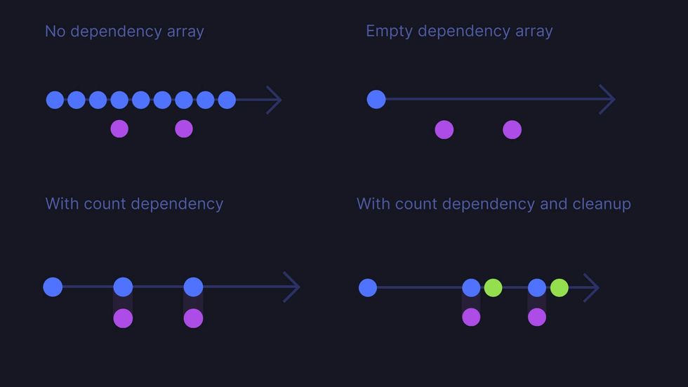
Even if we remove the labels, this simple visual representation of how useEffect behaves over time gives us a much better understanding of how it works than the linear syntax is able to.
III. Haven’t we already tried this?
Obviously, I am not the first person to realise that visual mediums enable us to understand and reason in ways that are worth exploring in programming.
The primary way people have tried to incorporate visuals into programming in the past is by sticking graphical user interfaces onto IDEs. These efforts all fall under the umbrella of what gets called ‘visual programming’.
There have been many, many past attempts at this, with varying degrees of success I’m going to quickly whip through a few examples so you get a sense of what’s been tried.
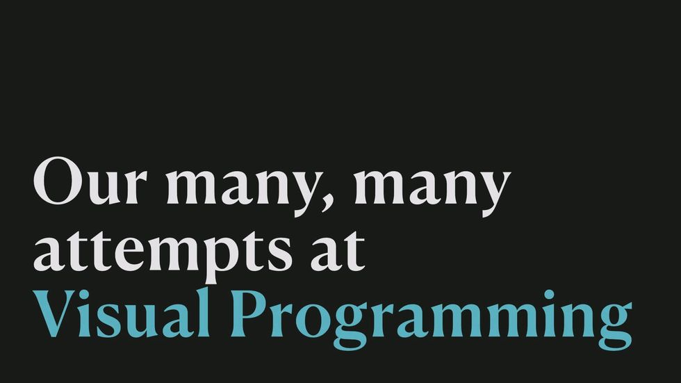
The very first visual programming language was Ivan Sutherland’s Sketchpad system in 196363ya
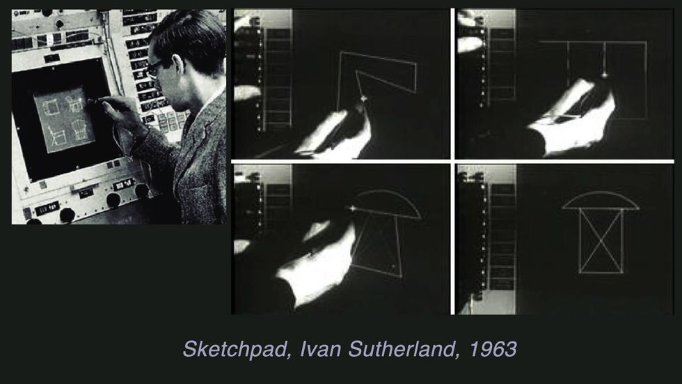
This is Grail from 196858ya where we put text into boxes for the first time.
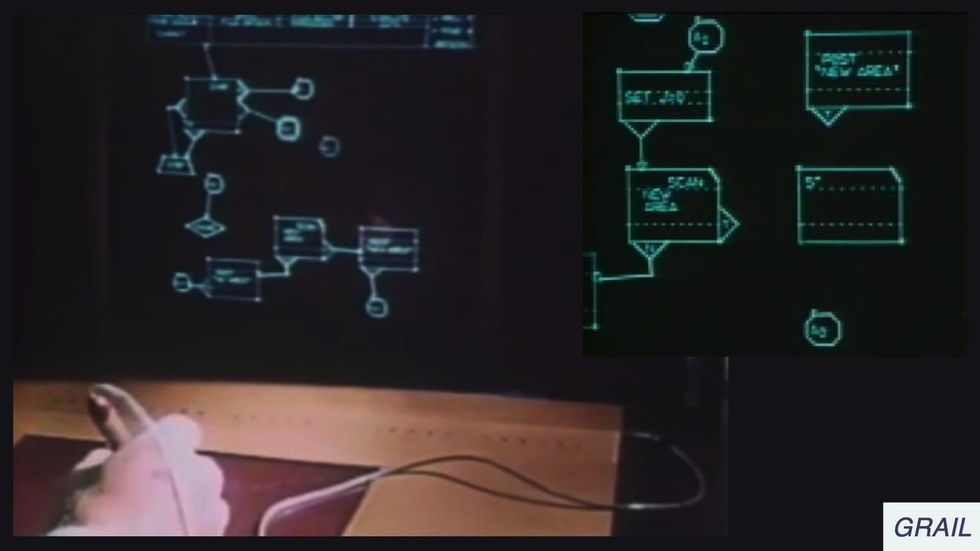
Here’s Pygmalion from 197551ya built on that box and arrow model.
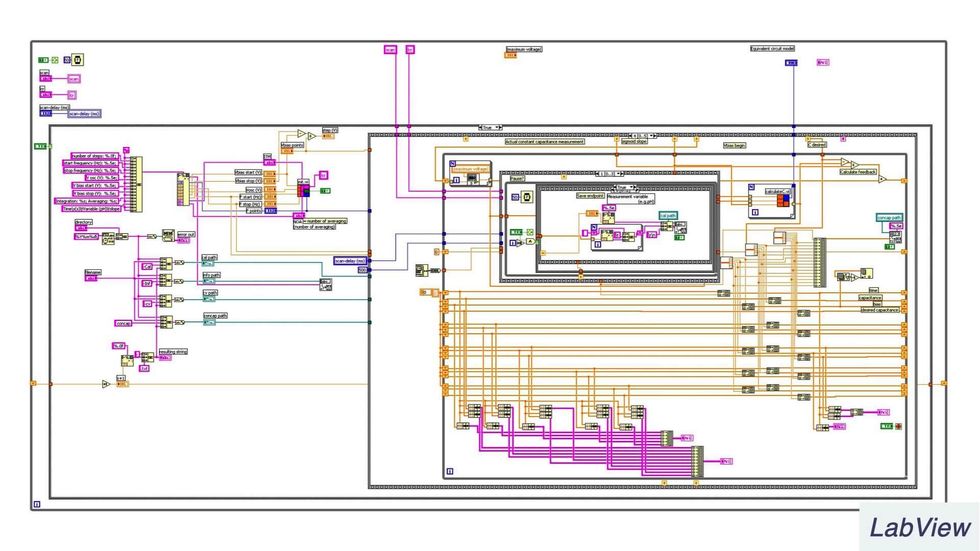
This is LabView which came out in 198640ya and is used for systems engineering
We got a lot more intense about boxes at this stage.
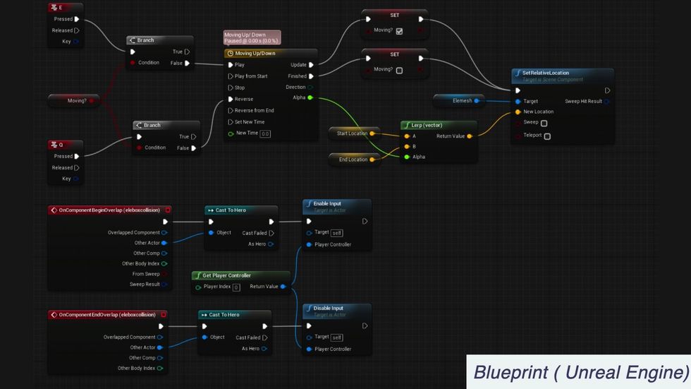
Here’s a more modern example, this is Blueprint in Unreal Engine which is used for 3D game development
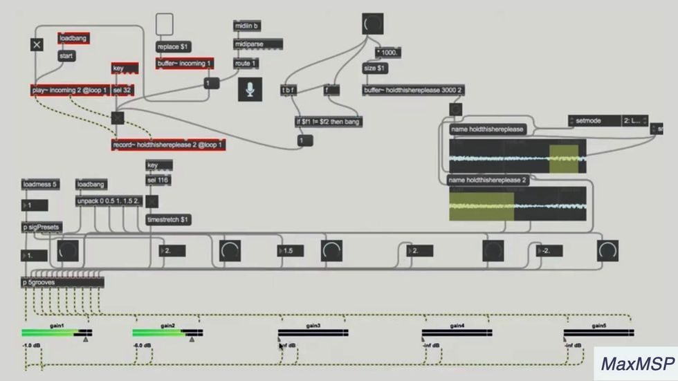
This is Max MSP is widely used for building audiovisual experiences
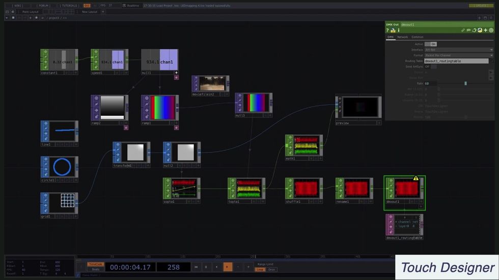
Similarly here’s Touch Designer which is also for interactive multimedia and 3D creations
This is Origami studio which is a prototyping tool built by Facebook.
You’ll notice the nodes and wires design pattern is very popular in a lot of these.
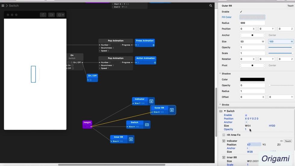
There’s lots of promising stuff in these examples, but visual programming is still relatively niche. We’ve also discovered a bunch of wicked design challenges with it that are hard to solve.
- These systems don’t scale well to large, complex projects
- They sometimes use ambiguous symbols and unfamiliar interface patterns
- Trying to turn everything into a box takes up way too much screen space
- They can lead to literal spaghetti code like this…
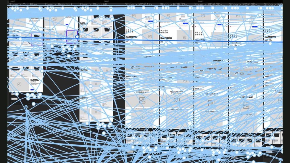
Being an advocate for it often feels a lot like being Gretchen in Mean Girls.

Visual programming certainly isn’t dead though.
Funnily enough, the new no/low code movement looks suspiciously like visual programming under a new name.
Many of the interface patterns that visual programming helped develop like nodes and wires, or direct manipulation are visible in tools like Integromat, Zapier, and Webflow
But rather than trying to build Turing complete visual languages able to reach industrial scales, we’ve tactically moved on to developing visual interfaces for specific use cases in programming with sensible constraints.
I’m a huge fan of the visual programming agenda and finding ways to add more visual affordances to our current developer tools. There are tons of smart, impressive people working on the problem.
But in many ways it’s taking the hard route – building a true visual programming medium will require overcoming a ton of design, culture, and engineering challenges.
And frankly, it’s probably going to take a while…
But there are easier ways to advance this effort in the short term.
We can simply sprinkle some visuals into our existing textual world.
Which means adding more diagrams and illustrations to blog posts, documentation, and learning materials.
And if we’re feeling brave, build plugins for our editors and developer tools that visualise small, scoped elements of our programmes.
This is essentially the low-tech, paper prototype version of building a fully-fledged visual programming interface.
So to wrap this up, here’s the thing I want you to take away from this talk.
We need more visuals that reveal…
- metaphors
- spatial meaning and
- change over time
To make programming easier for everyone.
It will make it easier for you since you’re an embodied human who needs to learn complex, abstract programming ideas in order to do your job well.
It makes it easier for all the people who don’t currently know how to programme but are trying to learn.
And it makes it easier for people who aren’t developers but need to understand what we do. Like product managers and designers who can’t read all the jargon in our text-heavy documentation.
So what can you, a humble but skilled React developer, do to advance that goal?
First, I highly suggest looking into the history of visual programming and some of the past attempts in that field. There’s a lot of previous art to learn from.
If you are a current or future creator of tools for other developers, you should consider ways to build visual affordances into your libraries, plugins, apps, or frameworks.
And finally, is to use and advocate for visual explanations in documentation and tutorials. That might mean making them for your own blog posts, or collaborating with designers if you work on larger projects with documentation.
That was a lot of information packed into one talk – this was a taster session to get you intrigued rather than a complete meal. Here’s books and links you can check out to learn more: