The Context
Whenever I’m on a punishingly long flight and feeling the ache of being crunched in a seat for a dozen hours, I soothe myself by opening up the live flight map. The tiny airplane trail is reassuring. We are making progress. We are on track. We will one day be free of this plane. Yes of course I wrote this opening while on a 14-hour flight.
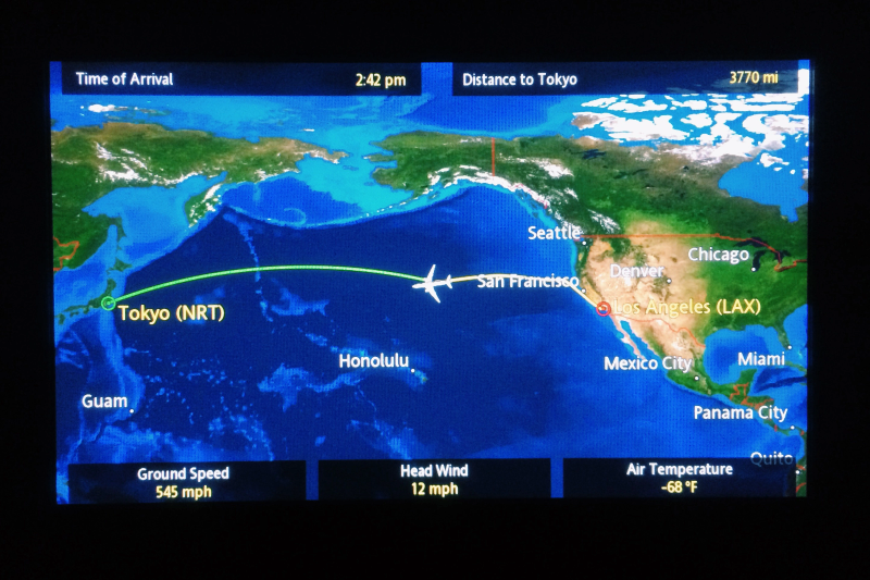
When I’m on a journey through a dark swamp of information, I want that same sense of reassurance that flight map gives me. I want to know:
- Where I am right now
- Where I’m going (and how long it’s going to take to get there)
- Where I’ve been and how I got here
Most interfaces are decent at the first two. We have lots of patterns that tell me where I am right now, like active items, focus states, and progress bars. Even though these are usually lying to us, they still make us feel better. Users will wait longer and be less annoyed if you just give them a fake progress bar. that indicate our current “position” in a process or navigation space.
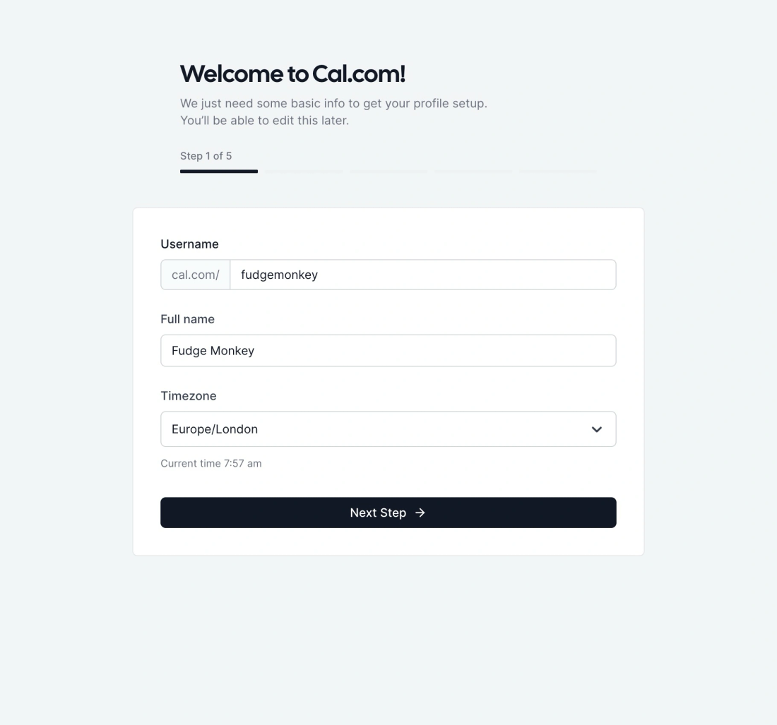

We also have good patterns for guiding me towards a known destination. Patterns like steppers and clear copywriting on buttons telling me what’s coming next.
It’s a bit trickier when neither the interface nor I knows the final destination, as happens in information gathering, research projects, and open-ended learning, but we’ll save that problem for another time.
But very few interfaces do a brilliant job of the third need: showing me where I’ve been and how I got here. We can do it at small scales. Patterns like breadcrumbs help us navigate through website or wiki with lots of subpages, but those don’t scale well beyond ~7 steps.

For any journey that has more than a dozen steps, and may involve backtracking and branching off in different directions, we need much more than a simple breadcrumb list.
The most obvious and common context where this problem comes up is browsing the web. Every day you and I blast through hundreds, possibly thousands, of pages. And we do it chaotically. We open forty tabs in parallel. We have six windows open. We click down trails of links without knowing how we got from one to the next. We try to visually inhale an impossible volume of content.
It’s fine for most of it to wash over us. It’s probably junk. But then there’s that moment when you need to find something you just saw a few days ago. But god knows where the link is. Your brain cannot conjure the right keywords to find it through search. And your browser history list is 100,000 items deep. Good luck with that.
Even if you’re not looking for a specific piece of information, we have almost no visibility into where we’ve been in our browsers on a day-to-day basis. There’s no easy way to reflect upon or revisit what you’ve seen. Or recap and summarise what you learned. There’s a whole meta layer we’re missing here.
Surprisingly, most browser history experiences are woefully inadequate. If we look at Chrome, the most widely used browser by a good margin, the main history page is a flat list that runs for eternity.
Scroll this for a while…

How useful does this seem to you? You’ll have noticed the giant stack of identical Google Maps items, and the many informative (63) Post | LinkedIn entries. Does looking at that give you a good sense of my browsing journey and what I saw along the way? Can you tell how I got from one page to another? If I was trying to jump back to a specific point in time, do these titles give me enough information to know which point to click back to?
Perhaps this page is not designed to be looked at; perhaps I’m only supposed to use the search bar at the top? Shame it doesn’t have any filters or sorting either.
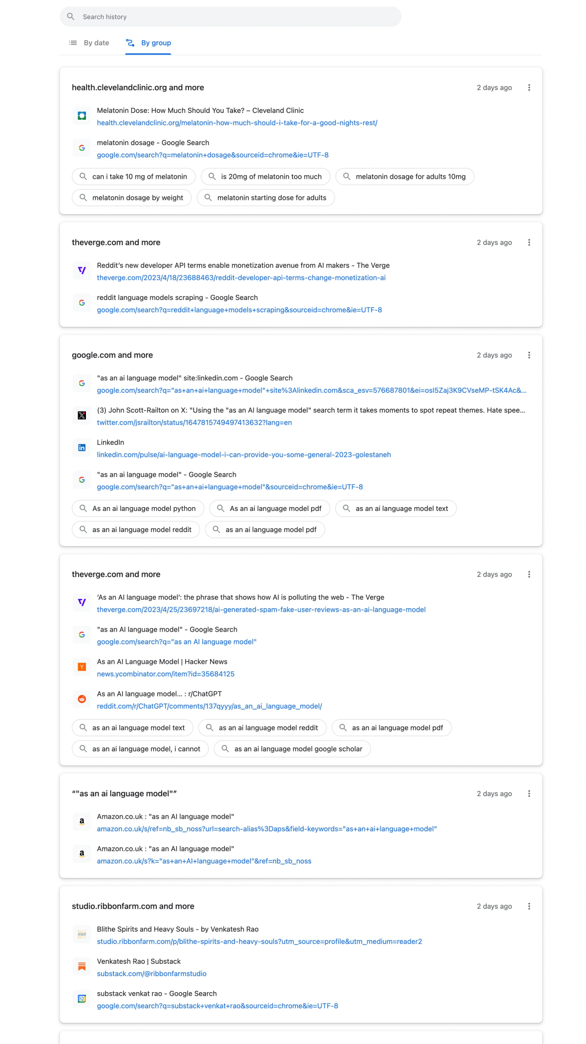
They do have a second view that groups these pages by theme and time, which is a helpful step up. But I find these are still quite scant on useful information and often split up items that relate to the same topic or browsing session.
So how might we show people where they’ve been in more helpful and nuanced ways?
The Pattern
Good historical trails should show people where they’ve been, even when the journey has been complex, looping, and divides into multiple branches of exploration. They should also summarise the major themes or journeys into high-level groupings, so that we can start at a macro level view and zoom into micro level items if needed.
Git is a good example of a widely used system that gives us fine-grained views of complex historical trails. With modern Git clients like Gitkraken and Sourcetree , you can visually see exactly who made which changes, when they made it, what branch they were on, and which branch they merged it into.
Git is a version control system primarily used to manage code. It allows many people to edit the same set of code files simultaneously. It helps keep track of who wrote which lines of code, see different versions of the code, resolve conflicts, and rollback changes if there’s a bug in the code or something goes wrong (and something always wrong).
Here’s a short written explanation that goes into more detail, or a 2-minute video , if you prefer.
Even with hundreds of people contributing code to a single project, the system of branching and merging makes the history comprehensible. Well, most of the time… we’ve all been burned by Git a bit
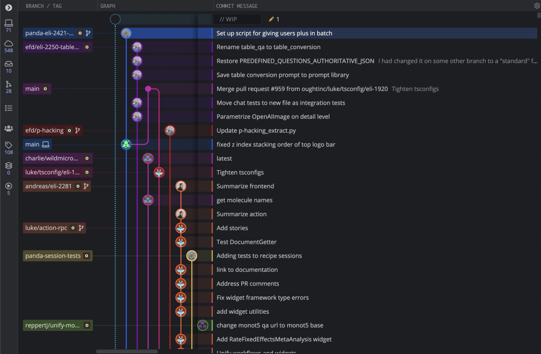
Perhaps web browsing histories should look more like Git commit histories? Perhaps distinct branches could representing different topics and research avenues?
Patryk Adaś’ published a set of speculative design ideas in 20179ya that hint at a more Git-like, branching way to view browsing history. Adaś argued we should move away from the concept of tabs in browsers, and instead present histories as a set of trails.
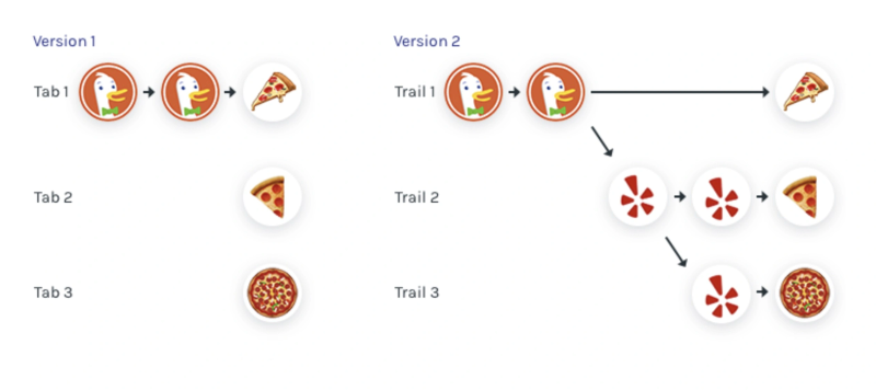
These trails would show users a narrative history, including the full trace of how a user ended up on a page, even if they used the back button or opened many new pages from a single source (like a search results page).
The trail model could give us a nice overview map of not only which pages we spent time on, but how we got from one to the next. While not specifically focused on histories, some of the qualities of my Spatial Web Browsing Spatial Web Browsing
Adding spatial affordances to the experience of browsing the web pattern could also give us this view.
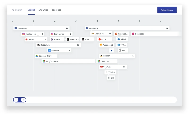
Adaś also prototyped a spatial navigation view for moving between these trails and viewing a ‘stack’ of previous pages behind each:
Adaś was building off some prior art here. Previous projects that explored visible trails of browser links include the Chrome extension Trailblazer and this unpublished draft paper by HCI professor Hua Guo. But neither of these are alive and usable.
One exception is Szymon Kaliski’s Cartographist which is an experimental open-source browser that combines a branching trail view in a sidebar with the (now quite popular) horizontally-stacked window pattern.
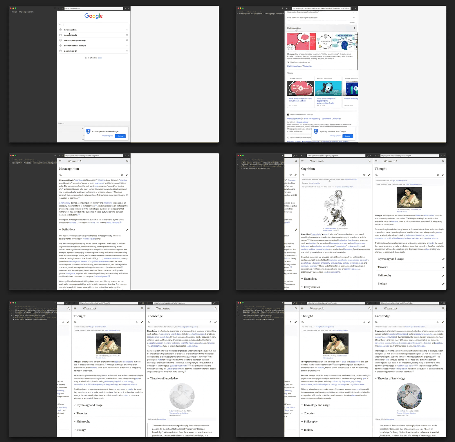
These examples all manage to display complex and winding historical journeys, but so far none do a great job at summarizing and grouping large histories. This is key for contexts like web browsing where we have thousands of tiny events we’re trying to search through and make sense of. We need to be able to zoom out.
Imagine Chrome’s grouped “journeys” I showed above, but less noisy, more accurate at clustering related sessions, and with visible trails. Perhaps something like this…
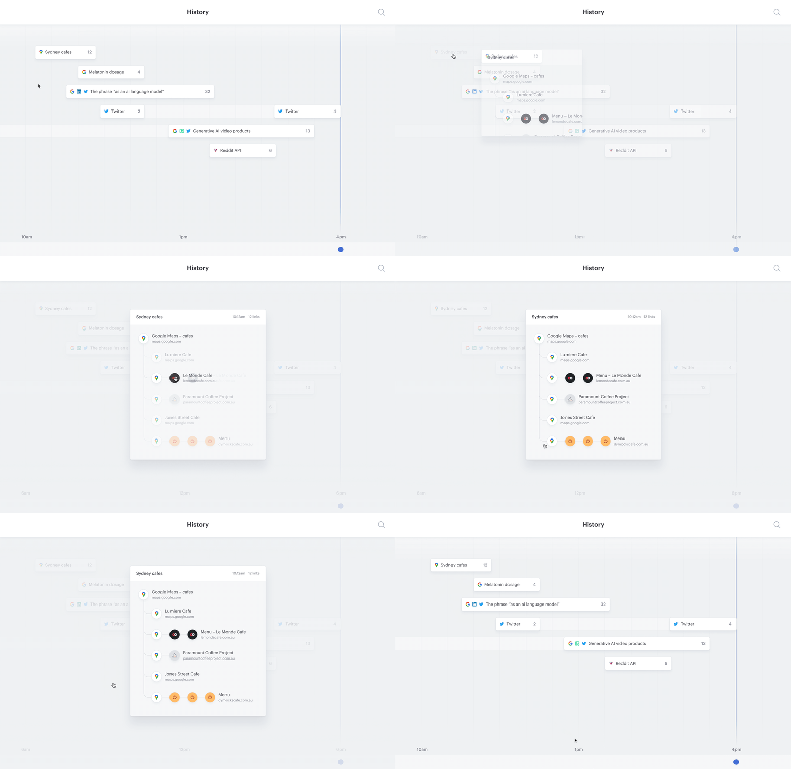
I’ve designed this speculative interface inspired by one of Patryk Adaś’ maps above, but with page visits grouped into thematically related journeys rather than by website. Here’s a more detailed walkthrough:
Grouping journeys by topic instead of by website is more feasible than you might think. While I’m hesitant to suggest the most popular hammer of the moment, language models could be legitimately helpful in improving semantic clustering.
Rather than only relying on rudimentary hints like keywords and timing to guess which browsing sessions are related, these models can identify which pages are thematically related and part of a unified journey – even across multiple sites and multiple days.
Putting the detailed, branching trail inside each journey avoids making this visually overwhelming. You can dive into journeys one at a time, rather than trying to process a giant list of links all at once.
