The Context
It’s hard to create a subtle sense of shared, synchronous space among multiple people on the web.
You and I are currently in an asynchronous exchange. I’ve written these words in the past. You’re reading them at a point in the future. We are not in sync.
Despite being on the same website – which suggests a shared digital space – it bears very little resemblance to how we might interact in a shared physical space in real-time.
We currently have no visual, audible, tactile, spatial, or embodied awareness of one another. We also have no awareness of the other people reading this post, even if they’re doing it at the exact same moment.
For a long time, the asynchronous nature of the web was a technical limitation. Internet speeds and bandwidth simply couldn’t accommodate anything beyond sending reams of static text to one another with long, slow lags in between.

But things have progressed. We now take for granted that our web connections refresh every few milliseconds. We experience most of it in real-time; spicy Twitter drama, collaborative editing in Google docs, overcrowded Zoom meetings, sensationalist BBC breaking news coverage, World of Warcraft tournaments, and the flood of emoji reactions on Twitch livestreams load in the blink of an eye.
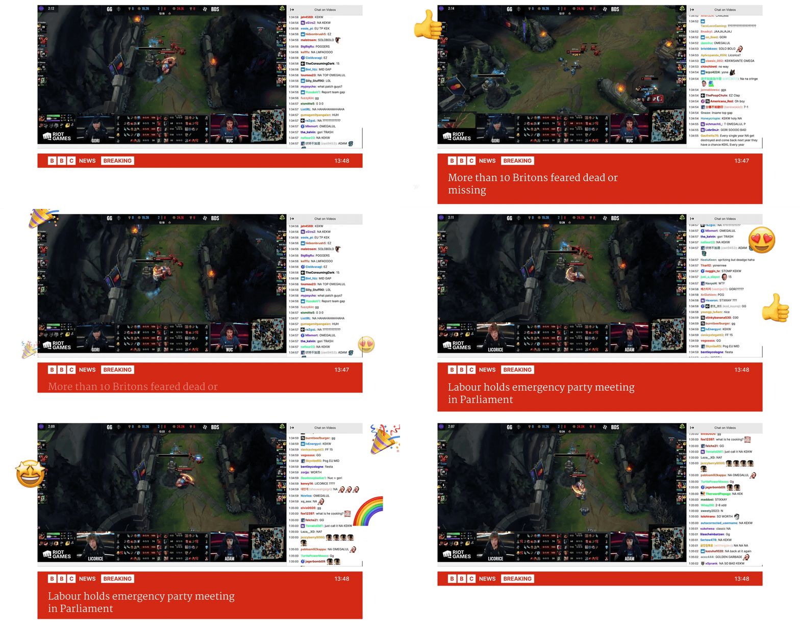
But it feels as though we haven’t quite clocked what’s possible here. The synchronous, multiplayer web is brand new, and the design space around it is still relatively unexplored.
Most of the web is still designed to accomodate slow-loading, single-player experiences. We all stare into linear, individualised feeds that lack the qualities of shared physical space; directionality, subtle awareness of those around us, opportunities for ad-hoc interactions, freedom to explore, and most critically, a shared understanding we are seeing the same reality as people in our immediate vicinity. There is no ‘vicinity’ when you are alone staring down a personalised content stream that no one else will ever see or know.
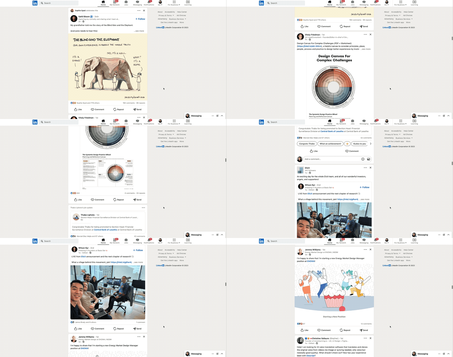
We don’t necessarily need to constantly interact with people “around” us on the web. The sensation of being in the quiet companionship of someone else, like reading next to them in a cafe, is what we’re missing. The sense of ambiently sharing space – of being co-present – while engaged in other activities is a staple of shared public spaces that we’re still figuring out how to design in the digital realm.
Our current “multiplayer” experiences draw too much attention to the multiplayer-ness. The other people around you demand attention. They move. They flash. They point to exactly what they’re focused on, drawing you away from your own focal point. We are missing out on a fuzzier, softer sense of the shared web.
The Pattern
Ambient co-presence is the sensation of sharing a space or context with other people, without directly interacting or continuously communicating with them. You’re all aware of each other through peripheral vision, ambient noise, and embodied sensations but aren’t necessarily doing the same tasks or directing your attention to the same things.
This looks like quietly reading on the back porch with family, sitting in a cafe full of people softly chatting or tapping away at laptops, or people watching from a shabby seat on the London underground, marvelling at the vast array of people that can exist in a single space.
The others rarely demand your attention or strike up conversations. They just exist nearby, unobtrusively doing whatever they’re doing. Providing companionship, comfort, and small windows of insight into how others choose to show up in the world and spend their time.
Multiplayer Cursors
Our current digital attempt at this is multiplayer cursors and selection. Other people who have access to your file are visible in the interface as small, pointy, colourful cursors or text markers within a document, canvas, or spreadsheet. Sometimes with little names or floating profile pictures next to them to help identify people.
As far as I’m aware, Google Docs was the first to implement this, quickly followed by everyone else. Notion, Figma, Miro, Mural, and most other collaborative platforms now use this pattern.
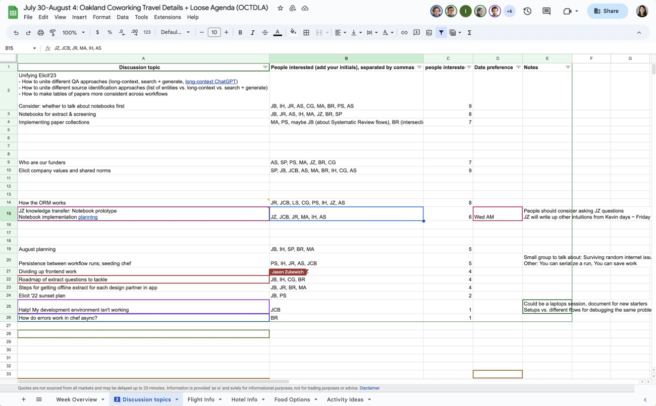
It’s fairly easy to implement this nowadays. My friends over at PartyKit have been exploring ideas ways to enable multiplayer experience with a few lines of code. For example, Cursor Party is a one-line script that gives every visitor to your webpage their own cursor, country flag, and chatbox.
Multiplayer cursors can add a sense of shared activity in digital spaces but lacks the ambient quality we’re seeking. Seeing exactly which word or design mock your manager is focused on isn’t the chill background sensation we’re going for.
They also don’t scale. Having hundreds of individual cursors zooming around an interface quickly feels overwhelming. Anyone who has been in a massive shared Google Doc or Figma file knows this sensation well. They’re better when used for smaller-scale, closed contexts like private teams and internal work.
To scale this feeling of sensing others in a workspace without being distracted by them, we could turn the pointy, specific, animated cursor into a softer, fuzzier hint of presence. More like a heatmap. Imagine having this on everything from New Yorker articles to little independent blogs.
You’d get a vague sense of other people reading live on the page. Perhaps this would feel a bit gimmicky and distracting. Or maybe we’d feel a little companionship. Perhaps a little thrill that someone else is reading the same words as us.
Here’s a less attention-grabbing variant that shows the volume of other readers on a page with a single soft, glowing blob:
This second approach is much calmer and allows us to show the presence of a large number of people in a space – hundreds or thousands – without it feeling chaotic.
It’s a soft starting point for layering on more attention-heavy interactions; leaving inline comments, making connections with people who always show up in the same spaces as you, or creating trails for others to follow.
Spatial Audio
Spatial audio feels like one of the most promising avenues to explore ambiently sensing many people in a space. Sound naturally follows a spatial gradient in physical space; people close to you are louder, and people further away are quieter, with many shades in between.
This gives us some flexibility between private and public conversations. We can move in and out of earshot of other people, or enjoy the low hum of other voices in larger spaces without being distracted.
Gather Town has done this well in digital space. It’s designed for distributed teams, and I’ve seen used for everything from unconferences to team retreats.
You appear as a game-like character in a fake living room or office, and can then move around the space. The clever bit is the video and audio channels of people around you fade in and out as you move closer and further from them. You’re able to move around a room and jump between conversational groups, just like at a cocktail party.
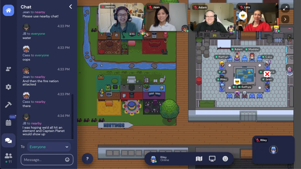
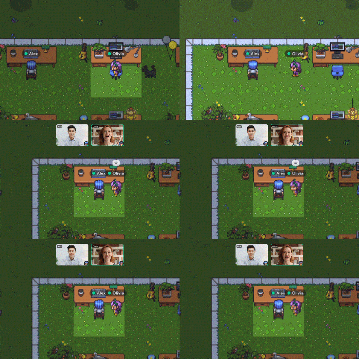
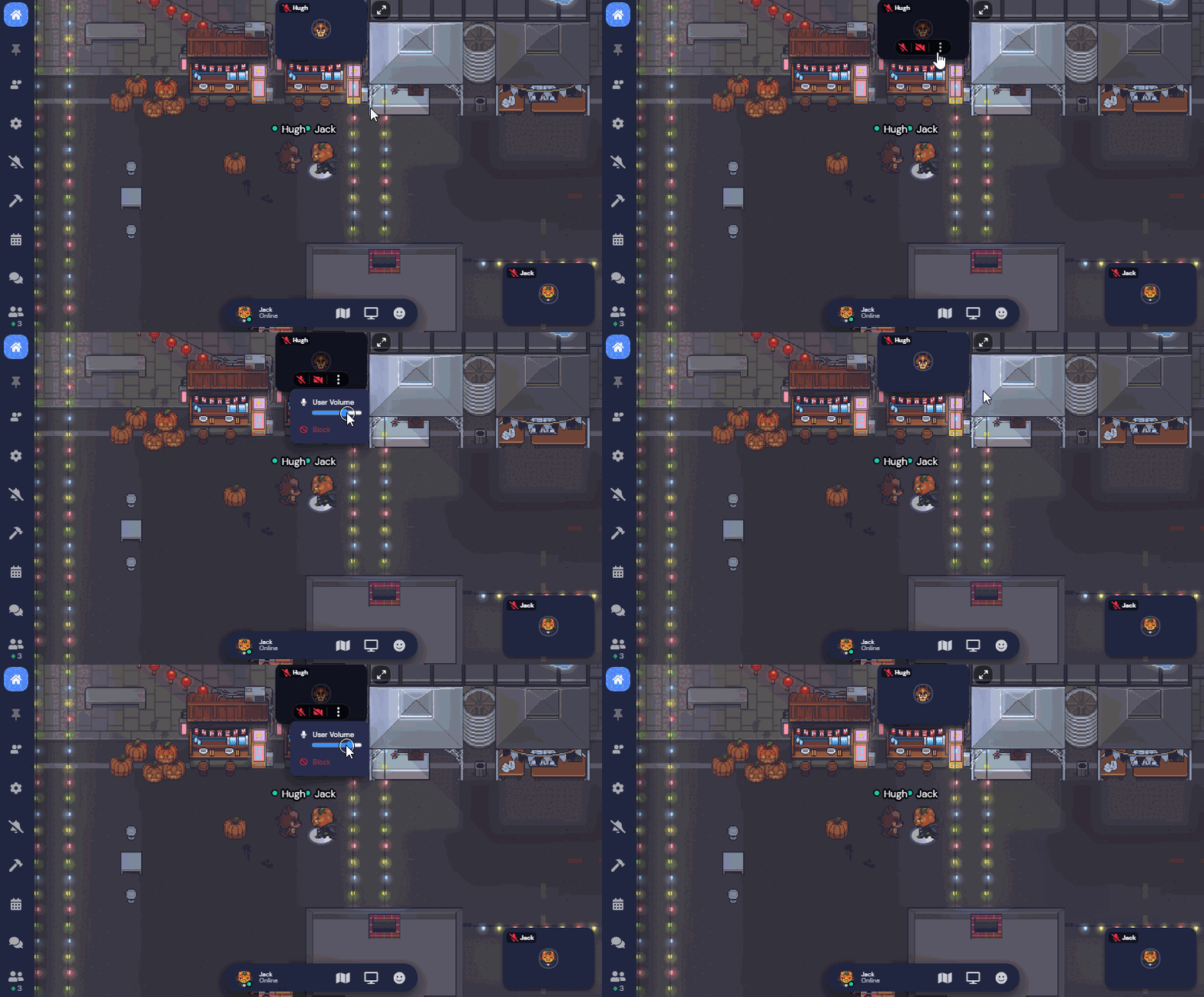
Gather town is fairly attention-heavy at the moment, but there’s room for more ambient versions of spatial audio.
It makes me think of the background sound apps like Noizio that many of us use in our deathy quiet home offices. They play the soft sounds of Parisian cafes and campfires to help you focus.
Perhaps in a Google Doc writing session with your colleagues you might hear the muffled taps of their keyboard, sighs, and light background music. Much like sitting next to them IRL.
Annotations and Trails
Annotations and markers left on public websites are less synchronous than the other patterns here, but give us a peripheral sense of other people’s activities. A few products are exploring this approach:
1. Highlights on Medium
The notoriously walled-off publishing platform Medium shows you the single most highlighted line from other users on article. But only one. As if no longform writing could possibly contain more than one useful insight. The ones published to Medium certainly don’t.
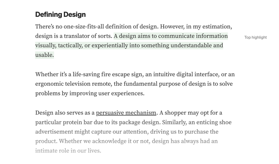
Readers can also comment on these highlights, but these are hidden in a side panel and hard to read.
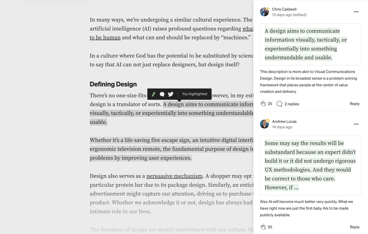
This feature is, of course, only available on their platform, which makes it remarkably less interesting or compelling.
2. Hypothesis
Hypothesis is a browser plugin that does this much better. It allows you to highlight and take notes on any content on the web. It works as an annotation layer over the internet. But one that everyone shares.
You have control over how public or private you want to make these annotations; public, semi-private within an invite-only group, or fully private.
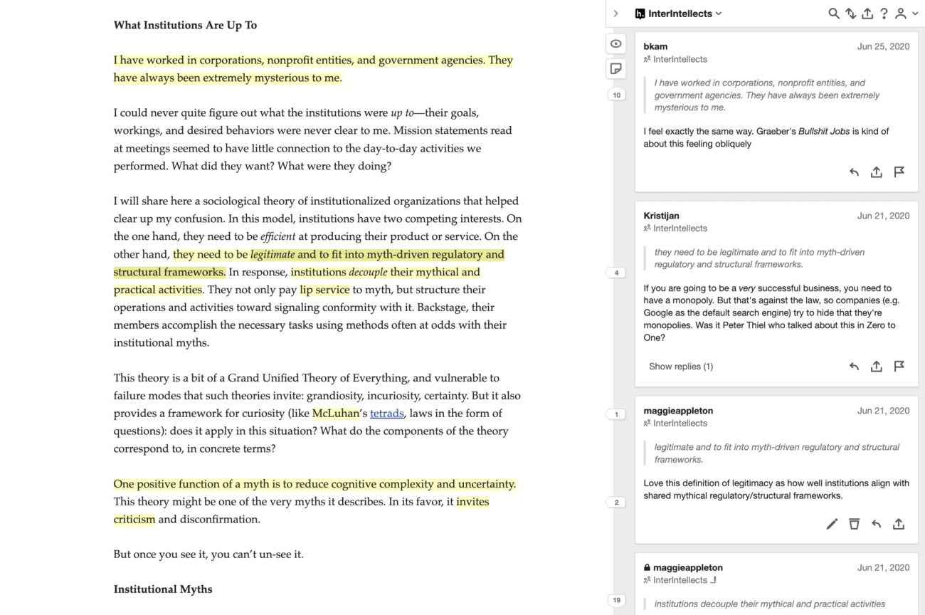
This makes it possible to open any article on the web and see what others have written in the “margins” of it.
I’ve done a few Silent Synchronous Reading Sessions Silent Synchronous Reading Sessions
Notes on how to run silent meetings and reading sessions with friends where we all open the same article, quietly annotate with Hypothesis for 30 minutes, then debrief on a zoom call. It works quite well!
I’d love to see more products exploring features that facilitate live, synchronous reading and highlighting. Hypothesis works, but it doesn’t feel very alive, reactive, or ambient when you’re using it.
Striking the balance between drawing too much attention to other people’s actions and providing ambient compansionship is tricky, but we manage it in physical spaces. We just need to keep exploring patterns for our digital ones too.